

Brand Identity
A collection of branding projects crafted for clients across coaching, entertainment, lifestyle, and conservation. These case studies showcase our approach to logo design, visual identity systems, and creative direction.
Project Selection
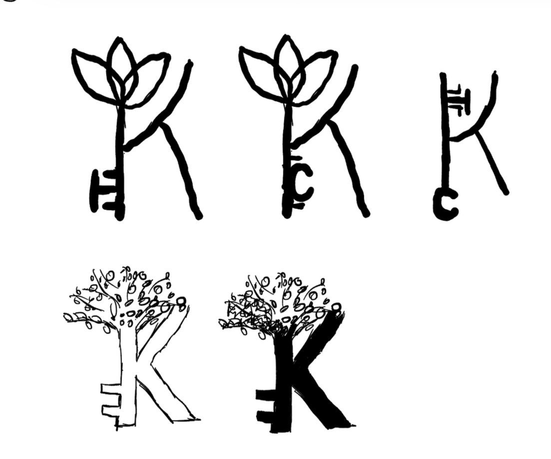
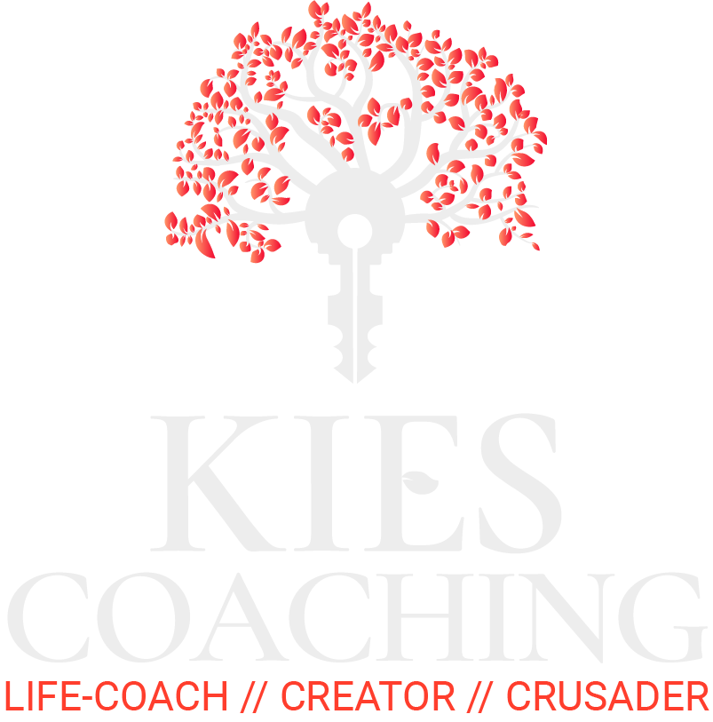
Kies Coaching Branding
Kies Coaching is my father’s life-coaching practice focused on helping people rebuild confidence, manage stress, and navigate the hardest phases of their lives, including addiction recovery. When he asked me to design his logo, I knew I wanted to create something that felt grounded, meaningful, and timeless. The visual identity needed to carry emotional weight, but still feel welcoming and human.
This project became a blend of symbolism, personal connection, and a whole lot of refinement; all built around the idea of unlocking personal growth.
Moodboard | Ideation | Zeroing In | Final Look | Programs used: Adobe Illustrator, Adobe Photoshop, Figma
Creative Process
Moodboard
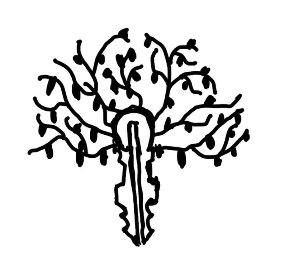
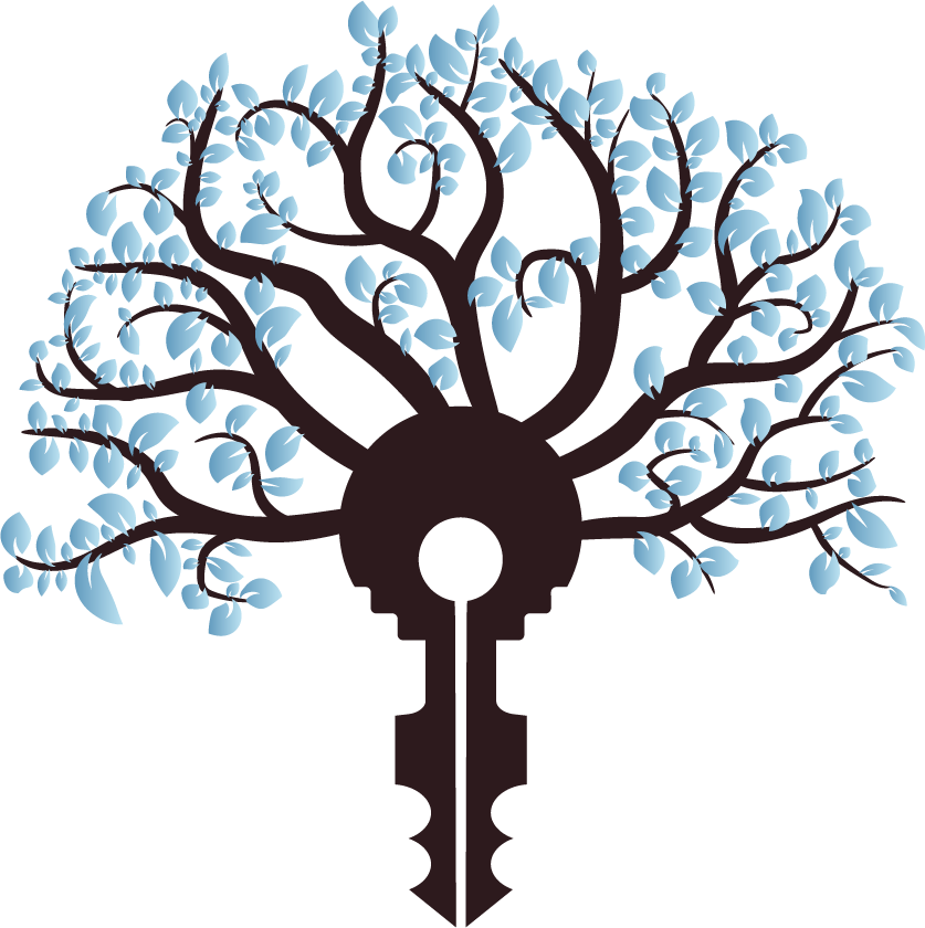
I started by exploring imagery tied to transformation; things that felt regal, calm, and rooted in inner strength. Trees kept showing up again and again: not just because they’re beautiful, but because the Tree of Life is a universal symbol of renewal, branching paths, and the idea that everything we experience is connected. It represents resilience, rebirth, groundedness, and that slow and steady climb upward.
Keys also became a central theme early on. The name “Kies Coaching” almost begs for that metaphor: the idea of giving someone the keys back to their life, their clarity, their direction. Combining nature with the symbolism of a key just felt right, it’s growth with purpose.
The moodboard captured all of this: earthy tones, strong silhouettes of trees, old-world keys, and natural light. It immediately set the tone for the entire brand.
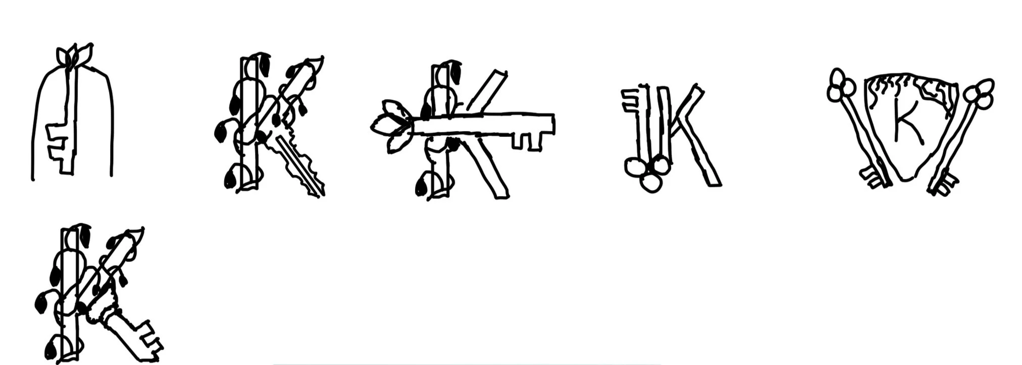
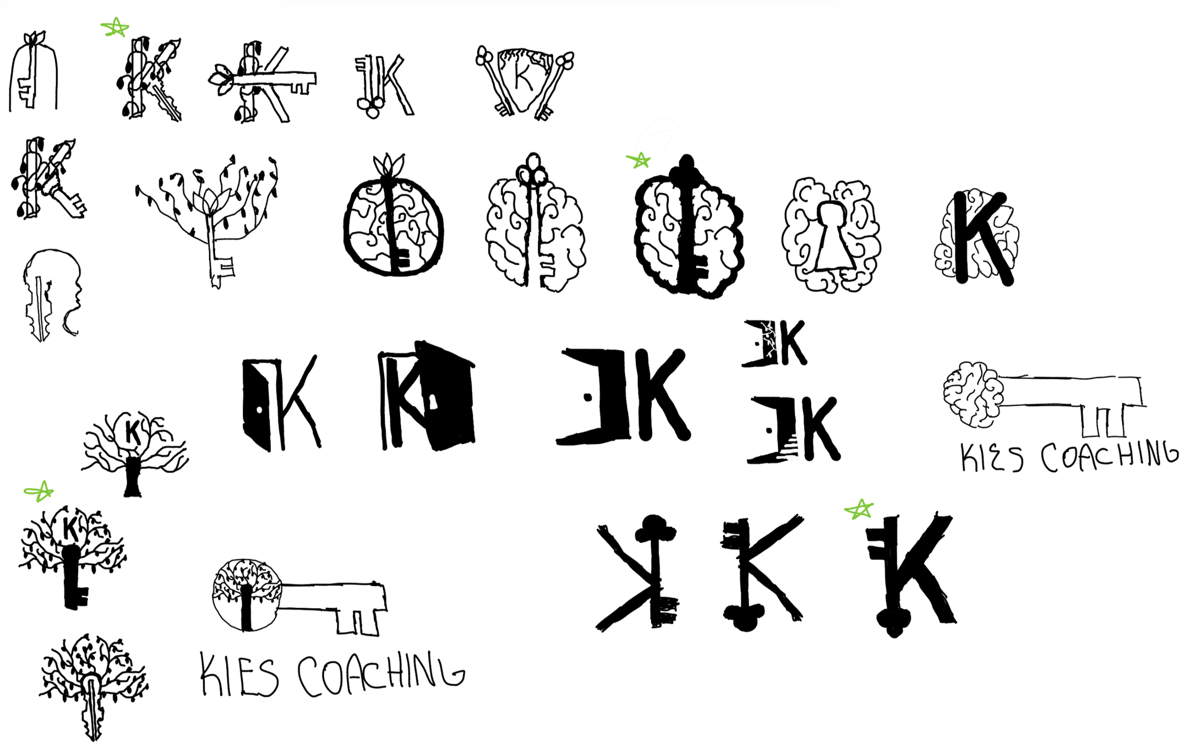
Ideation
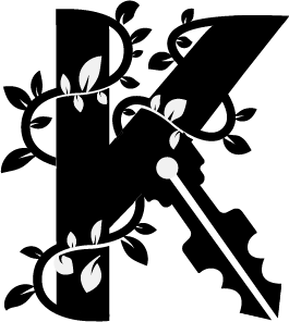
From the start, I was drawn to the fusion of a tree and a key; it captured everything the brand needed to say. Even though I pushed myself to explore alternate concepts (abstract marks, initials, simpler icons, etc.), nothing matched the emotional weight of the tree/key hybrid.
The idea really stuck because it told the story of what Kies Coaching actually does. Your branches represent the choices you make. The trunk is the foundation you build. And the key symbolizes unlocking that next chapter — the moment someone decides to change their life.

Zeroing In
Once I committed to the tree/key concept, everything became about clarity and balance.
I wanted to reduce the leaf count a bit to let the branches read more clearly, tightened the overall silhouette, and spent a surprising amount of time tuning the geometry of the key itself. The proportions needed to feel classic and trustworthy — not cartoonish, not modern for the sake of being modern.
This is also where the type decisions came in. I chose a font that feels clean and confident, something that complements the logo without fighting for attention. The typography helps anchor the symbol in a professional space while still leaving room for warmth and empathy.
Every tweak was about making the logo feel intentional, meaningful, and memorable.
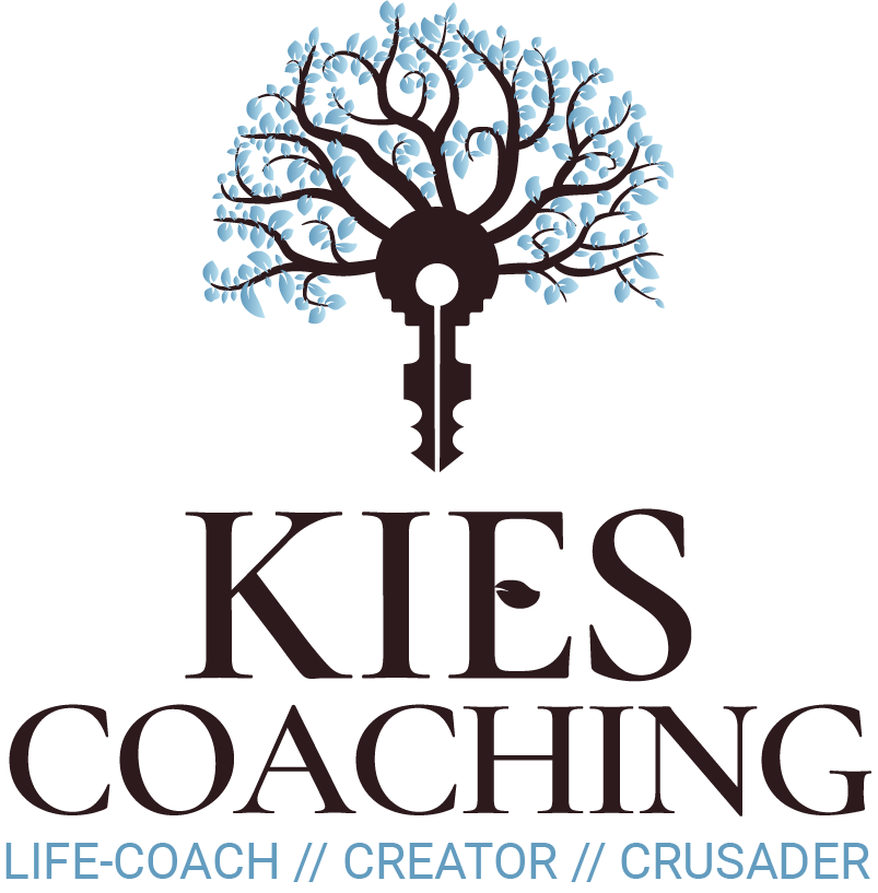
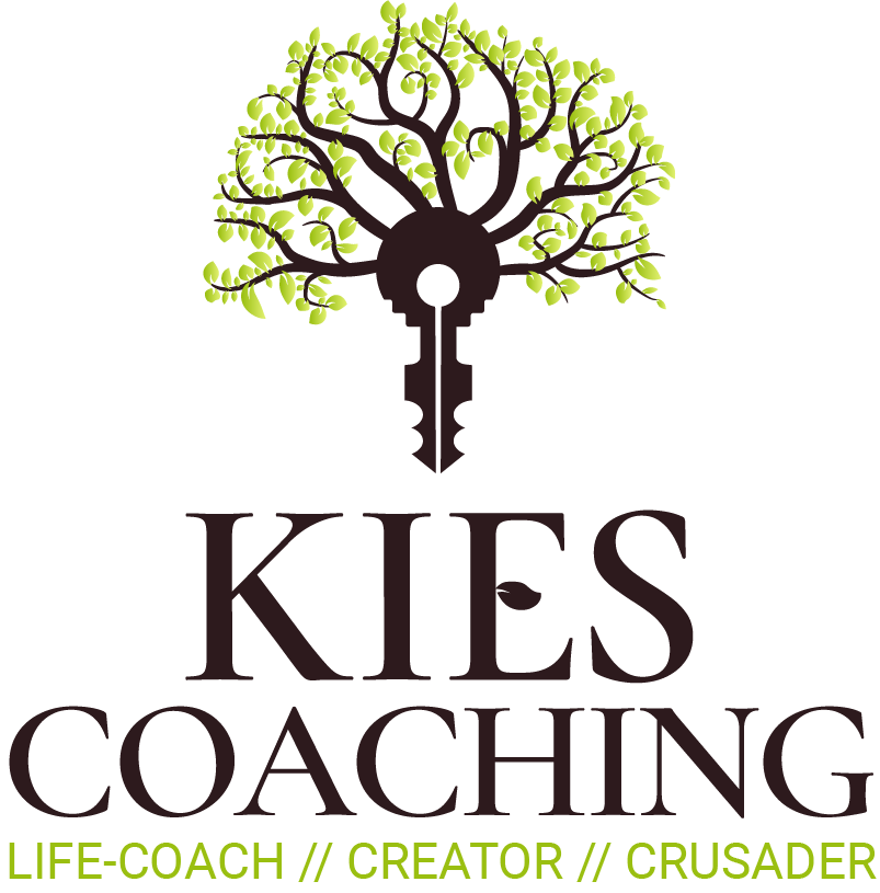
Final Logo
A Mark Rooted in Connection, Clarity, and Growth.
The final symbol blends the stability of a tree with the empowering nature of a key. It carries this quiet harmony, grounded yet uplifting, structured yet organic. There’s curiosity in the way the branches form, but also a sense of calm. It doesn’t shout, but rather invites.
To me, this version finally nailed the balance I was chasing: connection, harmony, and a real sense of “unlocking potential,” without being too literal.
It feels like something you’d trust with your life, which is exactly what life-coaching requires.
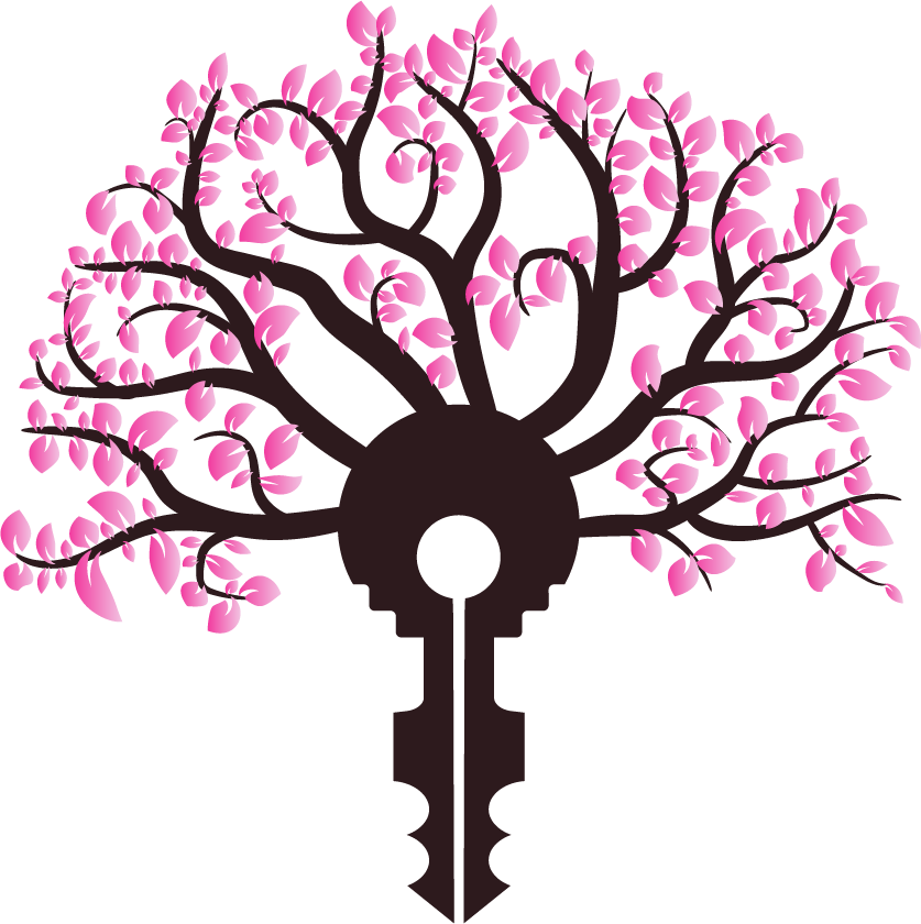

Seasonal Color System
Growth Looks Different in Every Season; So the Brand Does Too
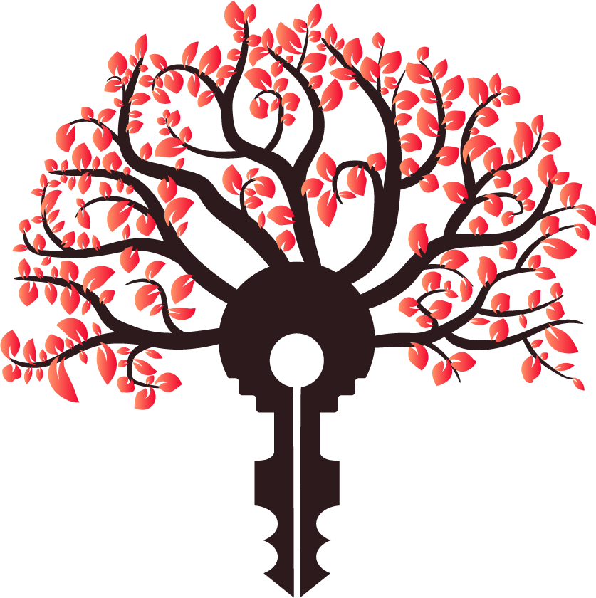
Because Kies Coaching is rooted in nature and personal growth, I designed the identity to subtly shift with the seasons. The core logo stays constant, but the leaf colors adapt, creating four distinct moods without ever losing the heart of the brand.
Fall
Resilience & Transformation
Fall takes on richer, warmer hues. The season to me is all about resilience, the idea that even as things get tough or start to fall away, there’s beauty in that change. Just like the leaves cycle every year, people can too.
Winter
Reflection & Connection
Winter cools down into soft blues. This is the season for slowing down, reconnecting with family, and assessing of where you are. It’s a reminder that stillness has value, and growth doesn’t disappear when things get quiet.
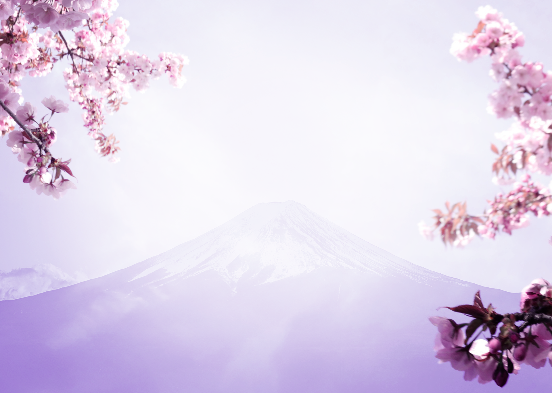
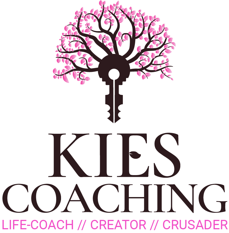
Spring
Hope & New Beginnings
For spring, I leaned into cherry blossom tones. They’re symbolic of renewal, clarity, and that quiet sense of optimism you feel when life finally starts moving again. Spring represents hope for the future and the moment where change feels possible.
Summer
Exploration & Momentum
In summer, the leaves shift into lively greens. This season stands for growth, exploration, and rediscovering yourself. It’s the energetic push, the “go out and try things” chapter of personal development.
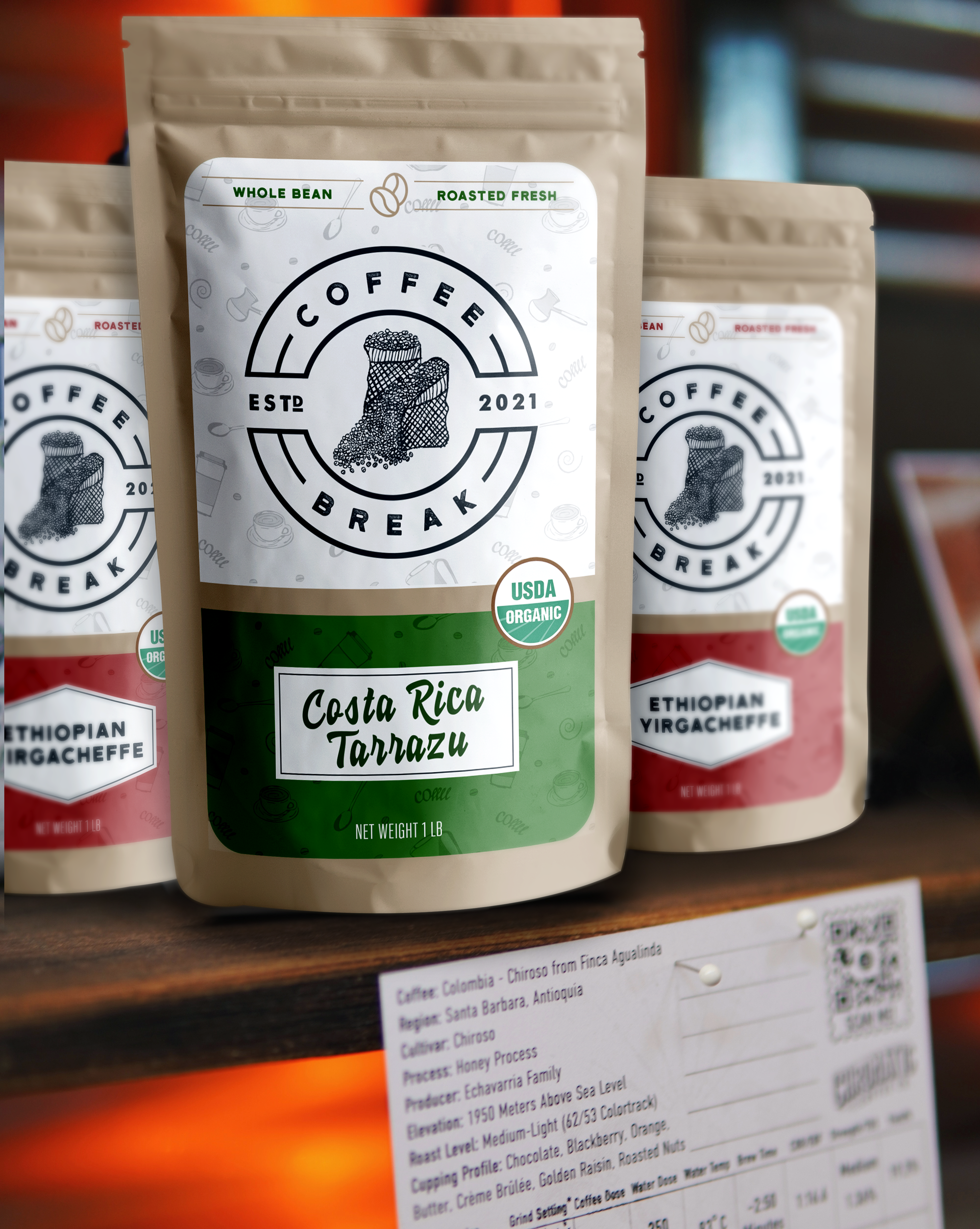
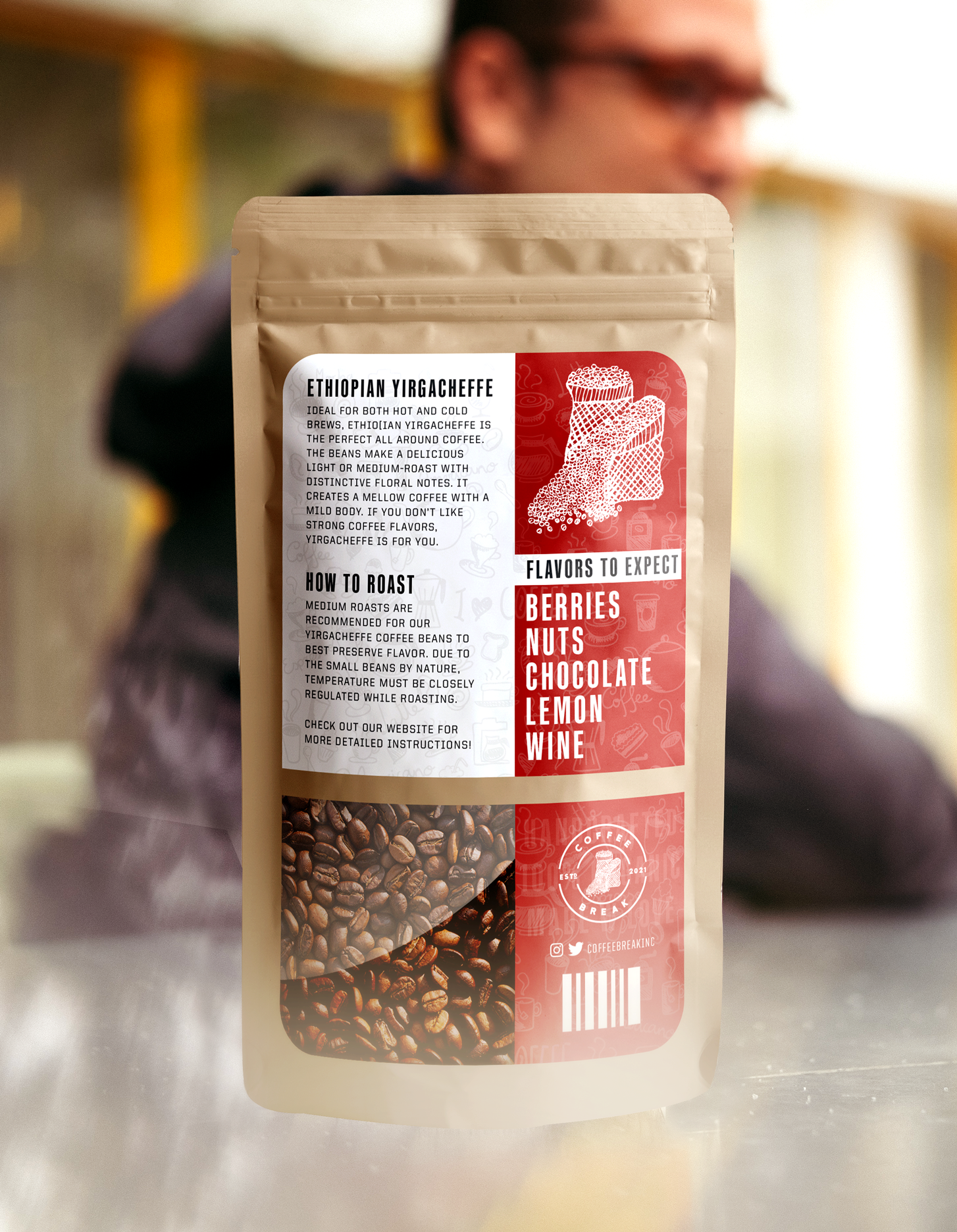
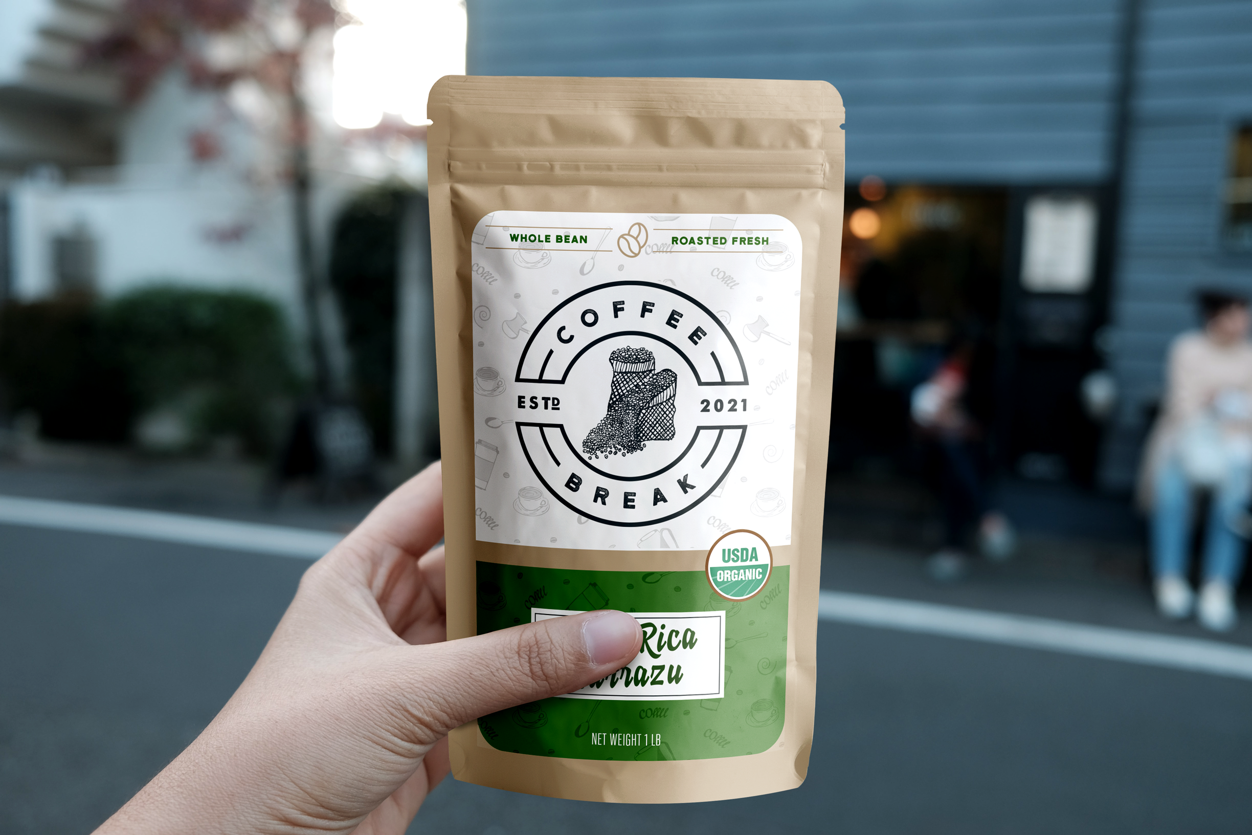
Coffee Break
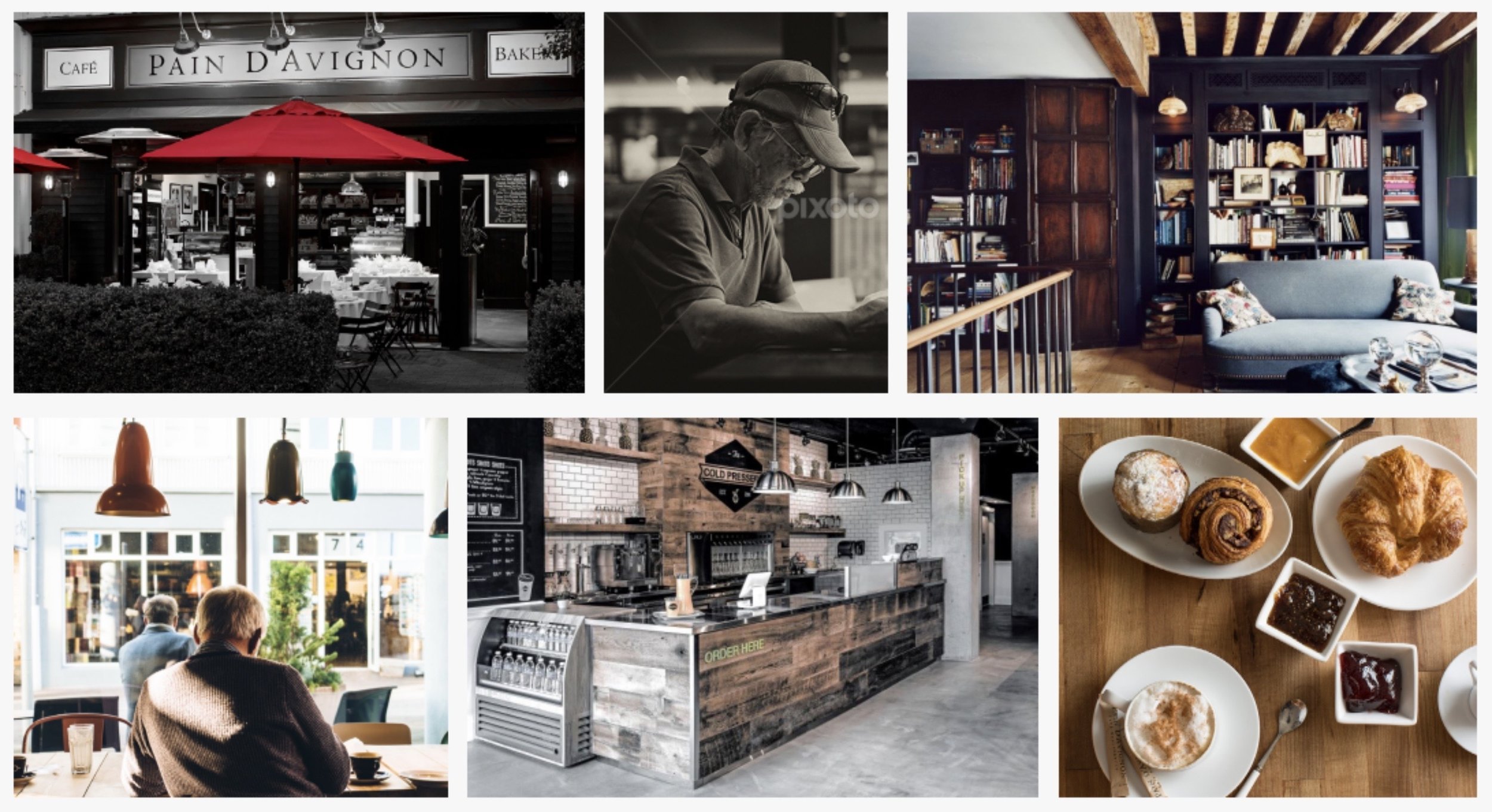
Now, we love coffee; we also love those quaint little coffee shops with the comfy chairs and jazz music playing. Perfect for getting some quality work done, or relaxing to clear your mind. The result - Coffee Break — the place you visit when you want a break from the world, and to indulge in good coffee. Below is the entire brand, as well as some coffee bag designs!
Moodboard
The mood-boarding process for this was more-so looking at photos rather than past logo designs from others. We had the idea of the logo in mind already, so the rest was just getting down an overall feel to support the logo vision.
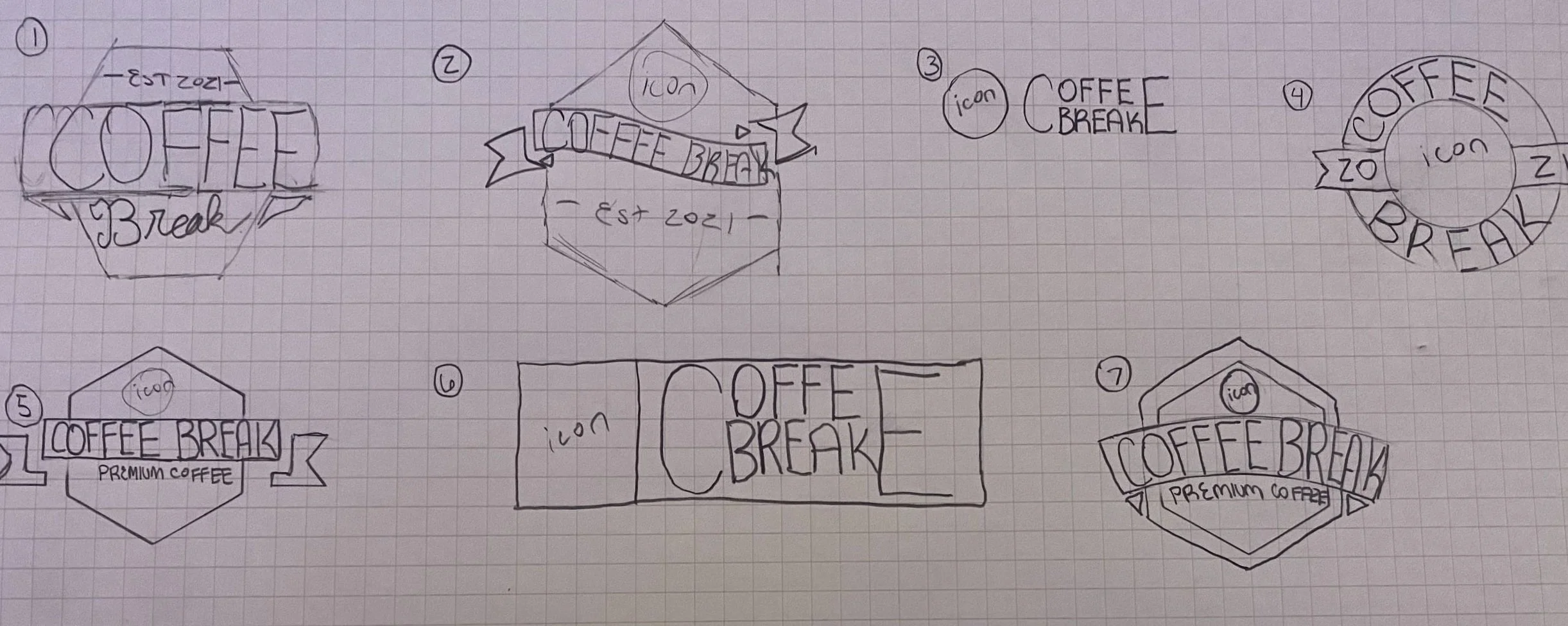
Ideation
Being that we wanted this logo to be hand-drawn, and we did not have a tablet at the time, our process was to brain dump various logo concepts and names for the company, then digitally transfer the sketches to the computer.
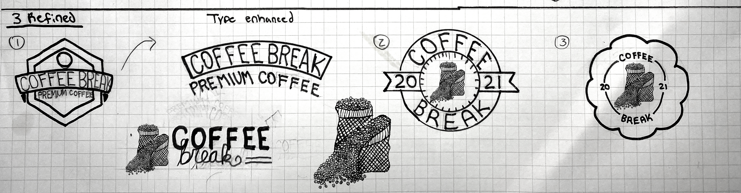
Refined Sketches
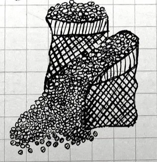
This is the icon we ultimately decided to center the rest of the logo around. As mentioned, the lack of a design tablet meant finding a workaround. Once we had the refined idea ready, we neatly re-drew everything how we wanted, and, for our design nerds out there, image traced the logo. For the less experienced, image tracing is essentially just tracing what we have on paper over to a digital environment.
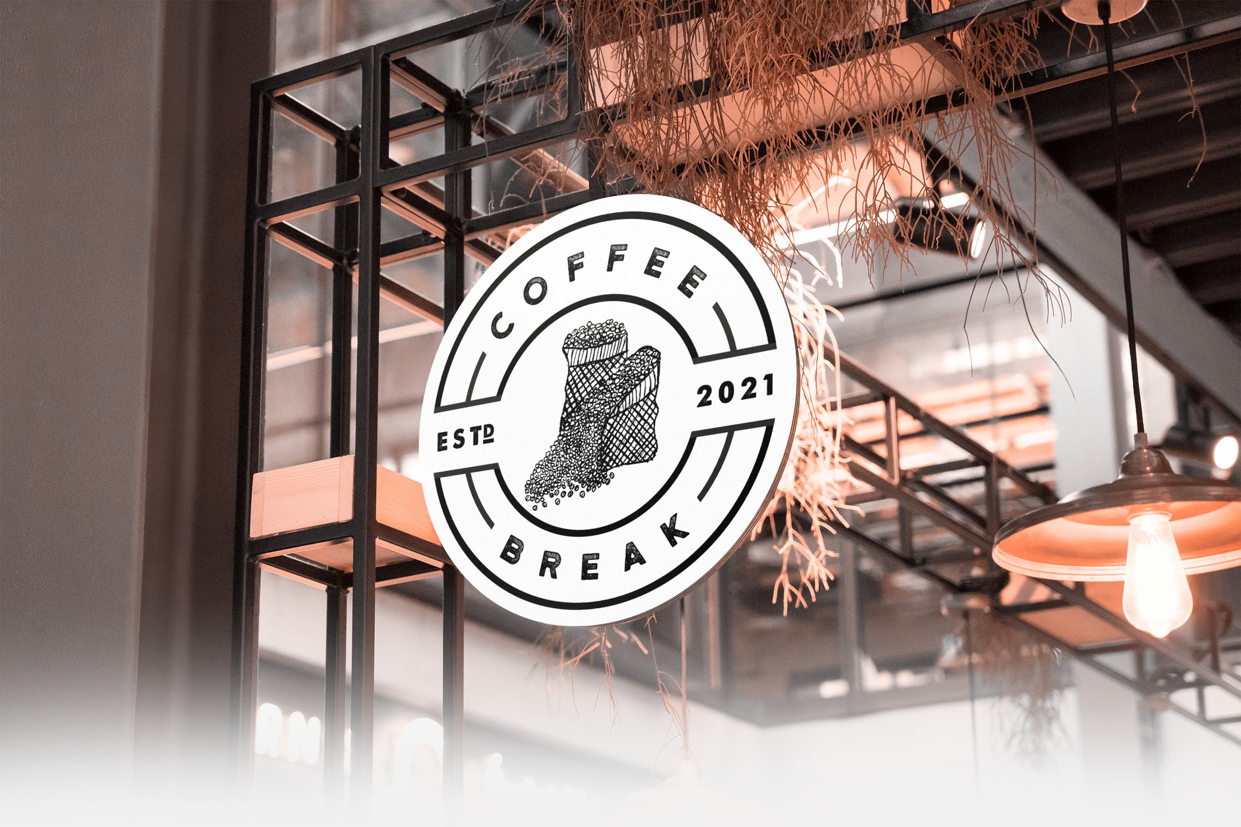
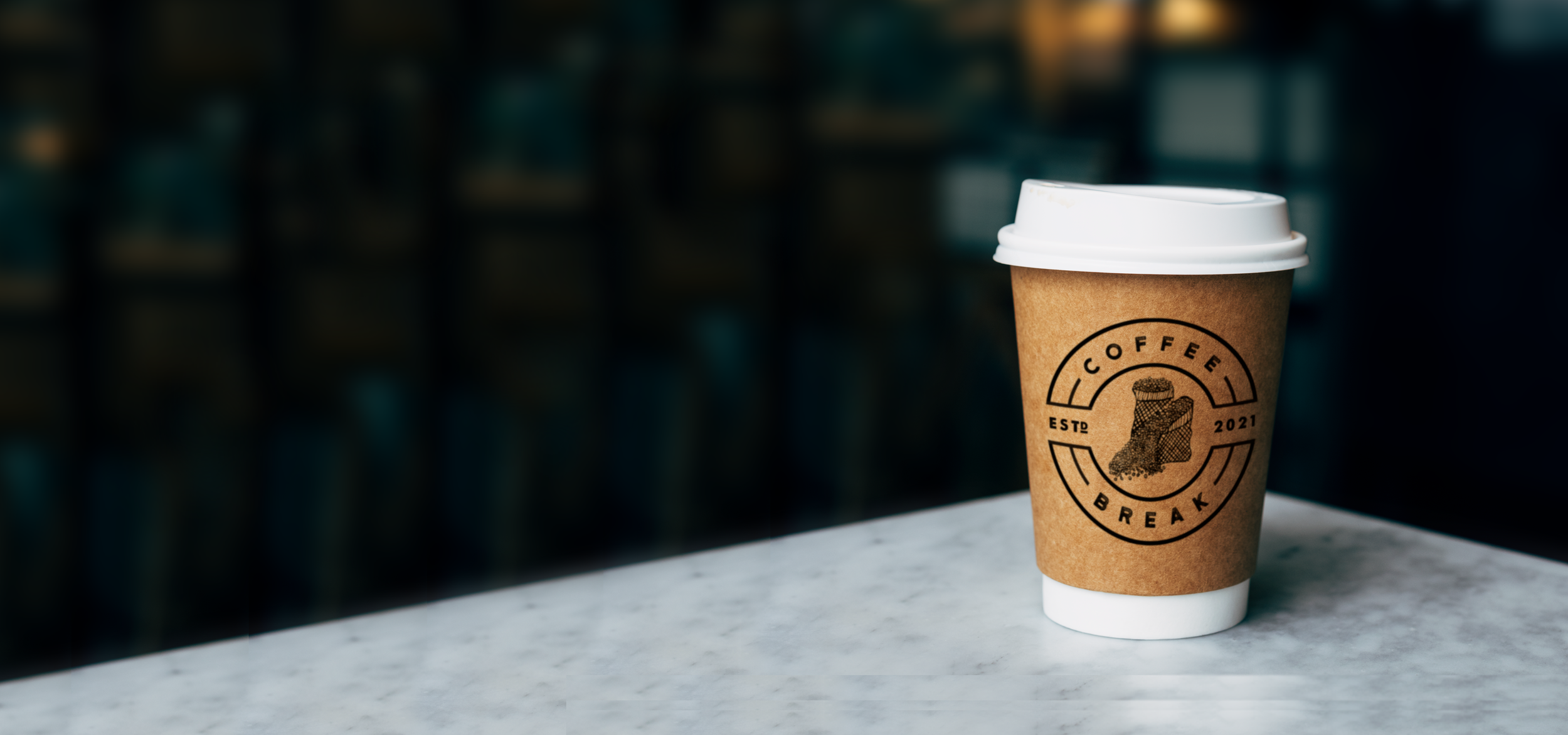
Final Logo
Hand-drawn, rustic, but elegant at the same time. The logos were designed for the various layouts needed for a coffee shop, from cups and packaging, to outdoor signs and business cards.
Packaging
Moodboard | Ideation | Refining | Final Look | Packaging | Programs used: Adobe Illustrator & Photoshop
Creative Process


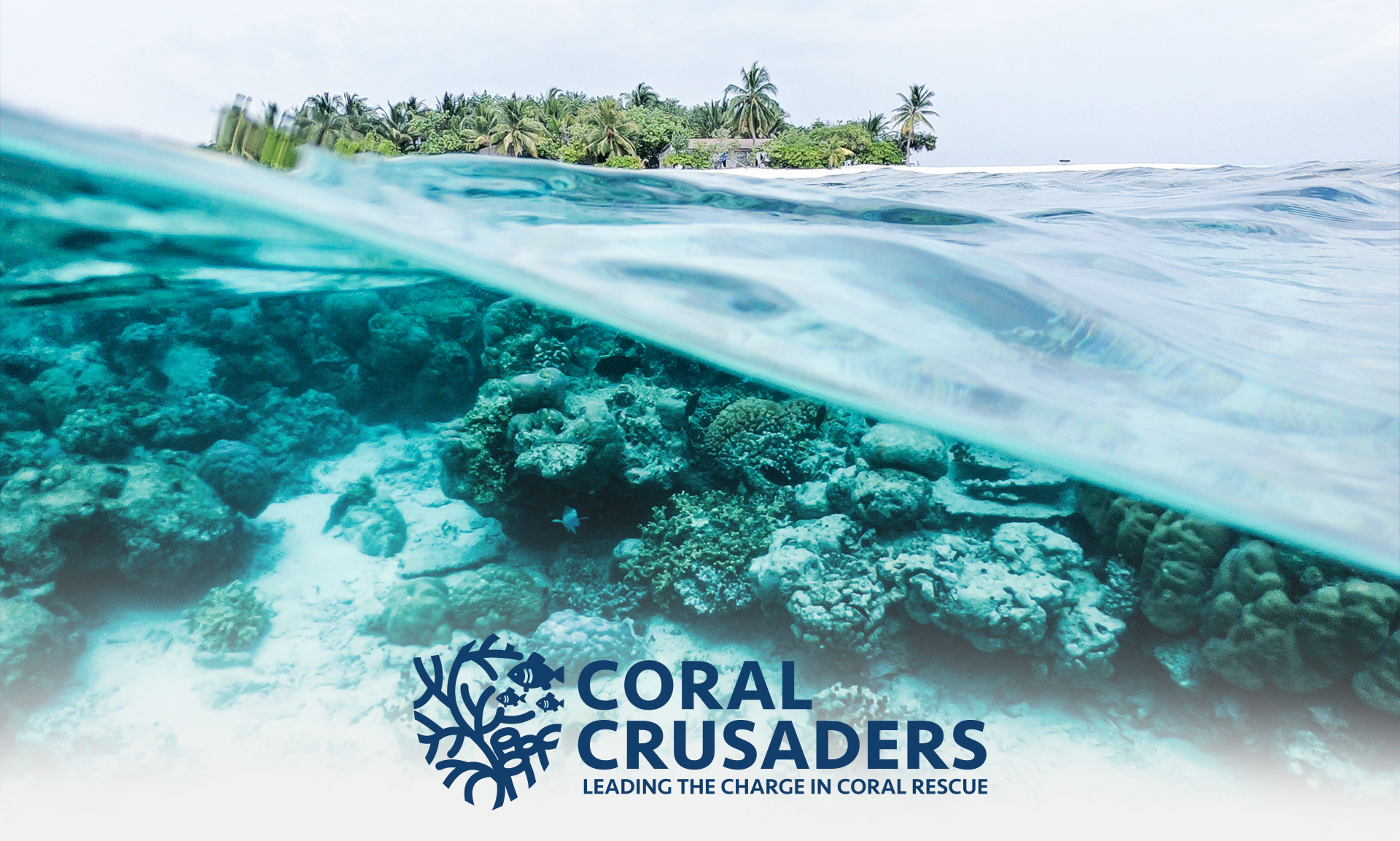
Coral Crusaders
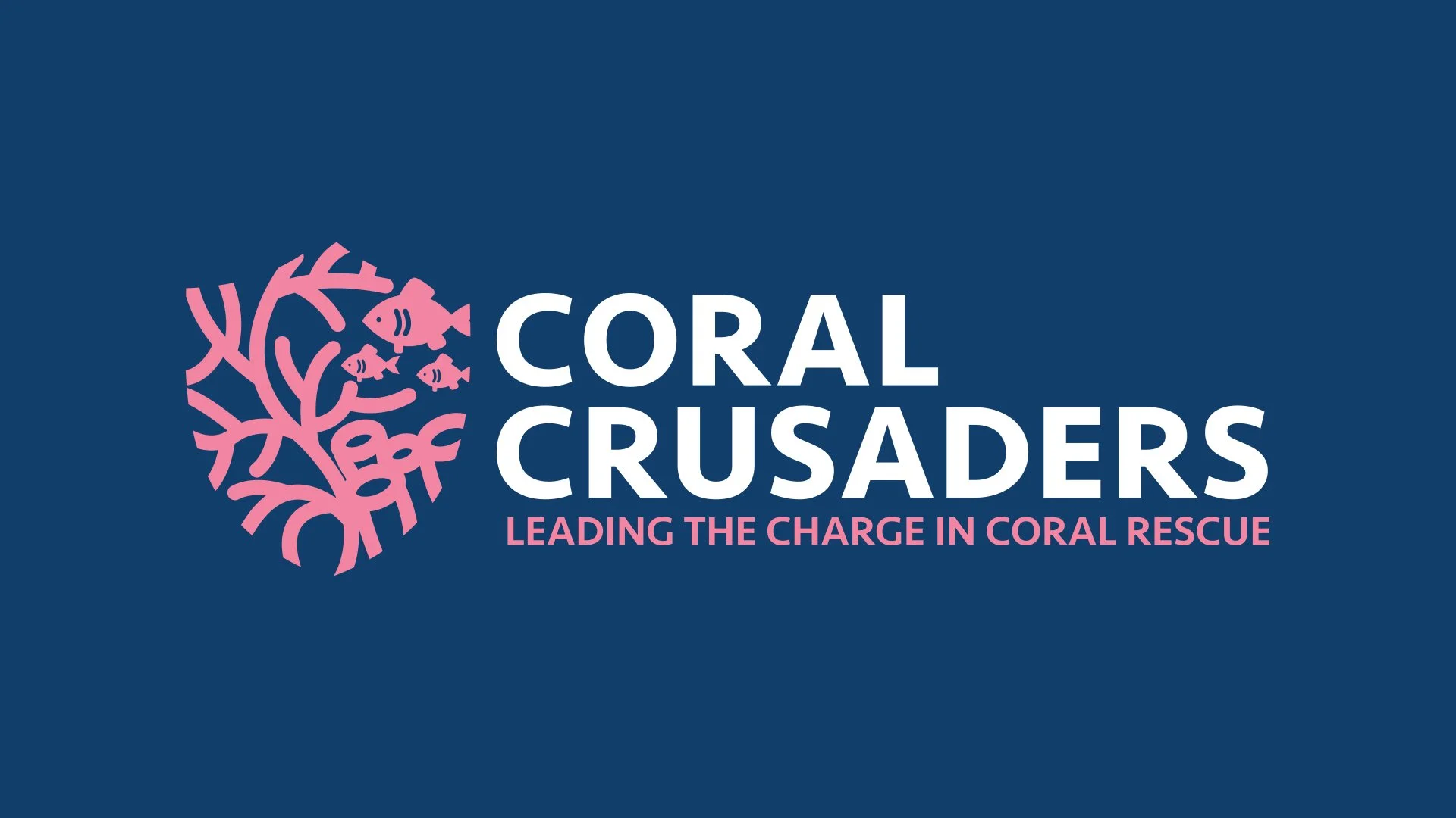
Coral Crusaders is a company devoted to educating people about the destruction of coral, and the importance it has on our society. This is done through high quality video, photography, and years long timelapses. Our goal - come up with a fun, but simple logo to kickstart the Crusaders into action.
Moodboard
The moodboard process helped us to come up with a gameplan, while conceptualizing brand image. Colors, level of simplicity, scalability, and more all became focal points at this stage. Scalability was a bit rough, as coral can naturally be so detailed. Deciding how to balance detail with scalability proved to be the biggest challenge of the project; we were all quite happy with the end result.
Ideation
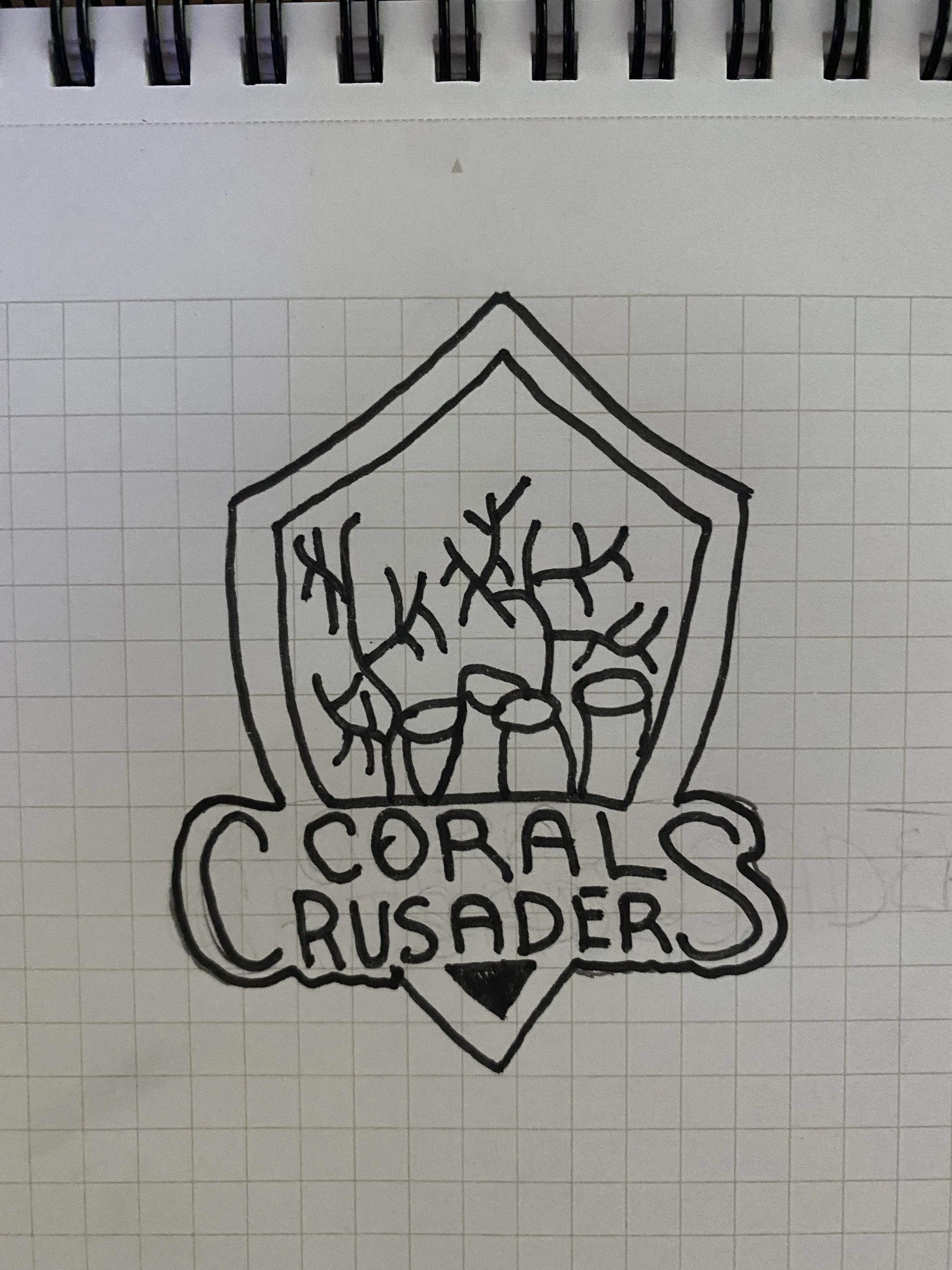
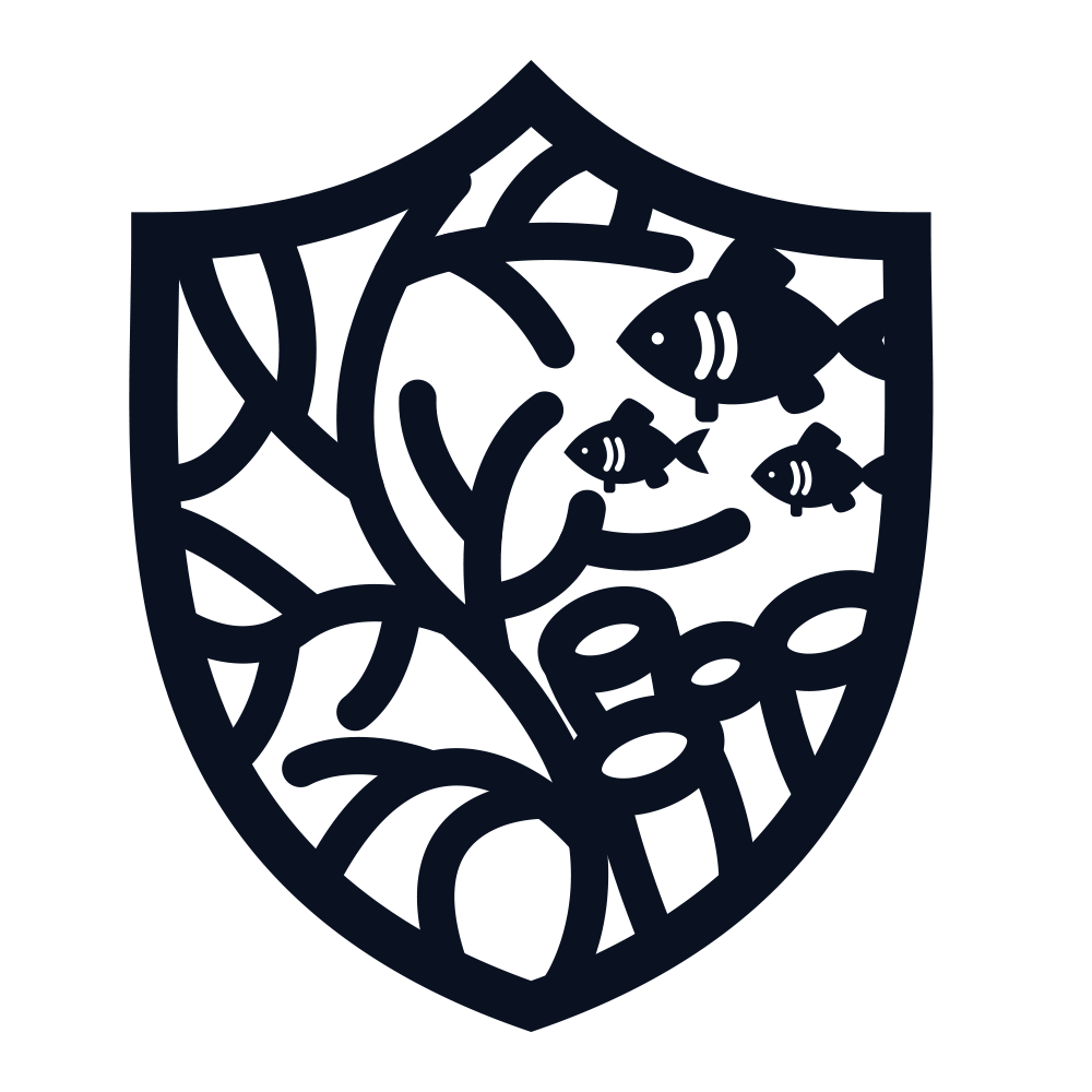
We had to decide the aspects of the logo first: The coral, the particular type, as well as a framing shape, which became a shield. With Coral Crusaders ideally being leaders in the fight to save our coral, a traditional shield shape was the key to translating an “on the front line” motif into the brands identity as a whole.
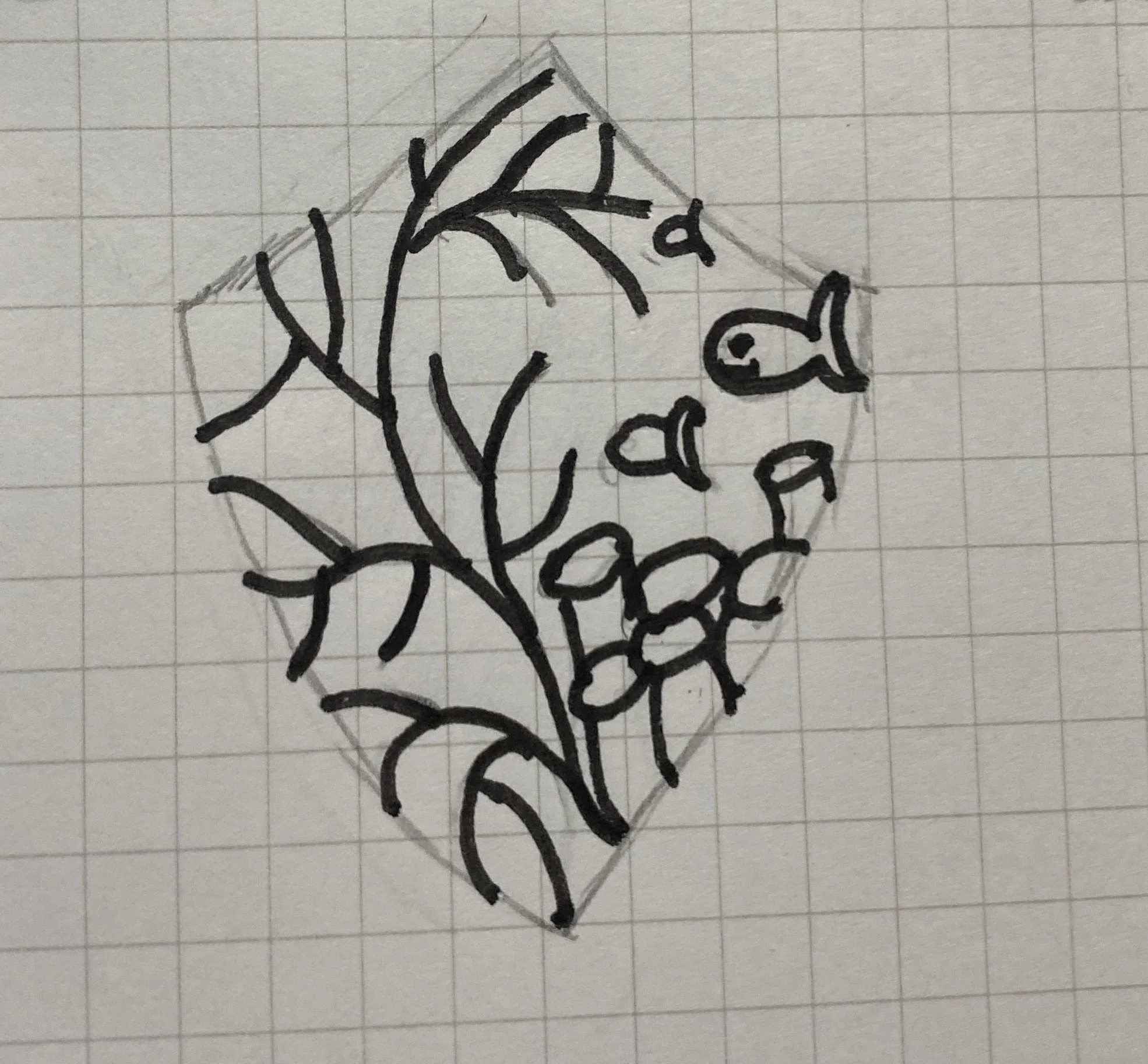
Concepts
These are the concepts created for the brand. Some we thought felt too detailed, but we love to start projects more complex and even a bit crazy, then reel it back as needed to fit customer expectation, brand identity, and target demographics. Of these concepts, the middle top one stuck out to us most. From there, we continued to refine that particular version into it’s final iteration.
Zeroing In
When it came time for refining the concepts, we decided that although the shield was pronounced, it felt too pronounced. With this in mind, we decided to remove the shield outline entirely; to us, this was it. The coral is pronounced, the scalability works, and the shield still feels present but subtle..

Final Look
For the final look, the colors were really the last step to tackle. We find it very important to leave color until last, as the base of the logo must be good enough without color before introducing any vibrancy.
For the colors, a brighter pink and darker blue were the choice. The brighter pink portrays not only the traditional color of coral, but also a sense of friendship and passion, two leading traits of the Coral Crusaders. The darker blue demonstrates the knowledge and power we as people can use to our advantage to help save our coral.
Moodboard | Ideation | Concepts | Zeroing In | Final Look | Programs used: Adobe Illustrator
Creative Process


Feneris
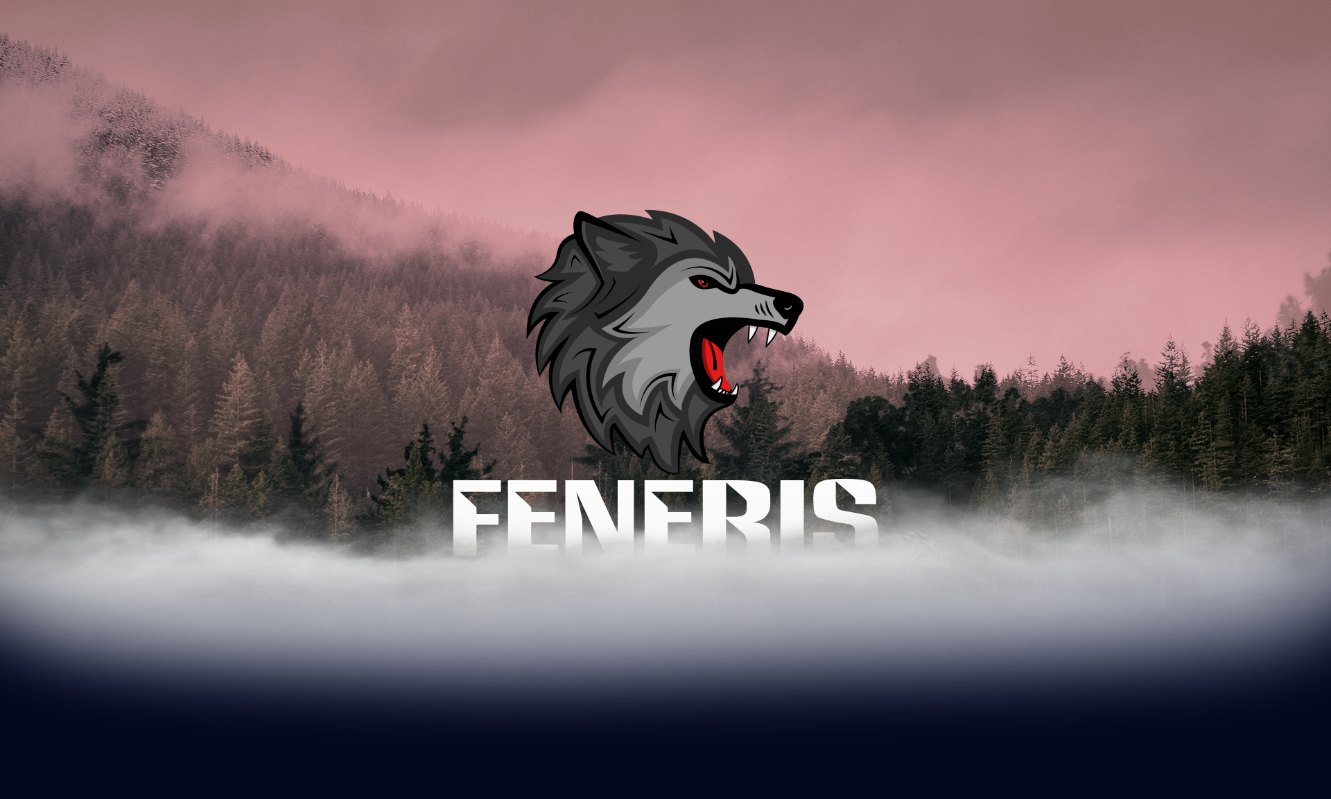
This was a project done for a client starting up an IT company. He has always had an affinity for Norse mythology, with Fenrir always being at the top of his list.
Fenrir, in Norse Mythology, represents strength, power, and freedom - embodied in the wolf. In the conception of this logo, emulation of natural life form was key.
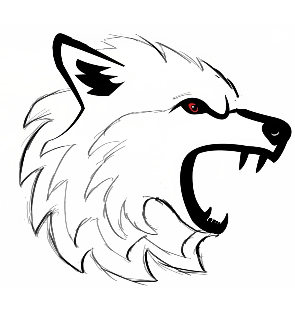
Moodboarding & Concepting
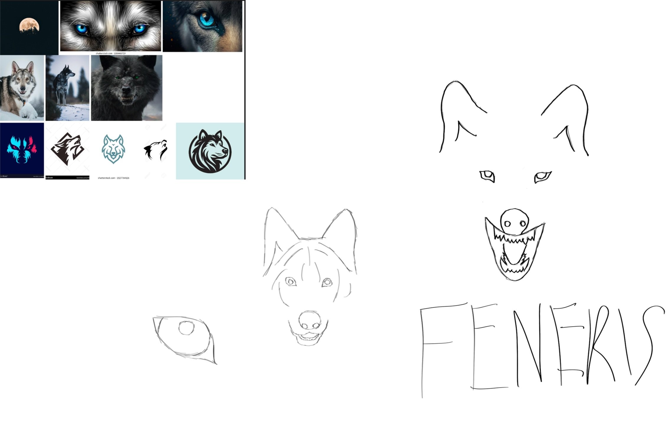
We knew we wanted more of a mascot logo for this design. While doing a mascot-style logo, we didn’t want to push too far into the realm of your traditional sports mascot logos. Those are often the bright, vibrant, chaotic ones you see. We wanted to ride the line of mascot and traditional icon logo. Our creative director, Zack, got to work with the initial sketches, taking into account the best poses, positioning, and scale of all elements.
Final Look
Introducing the final look for Feneris. Strong, balanced, smooth, but fierce. We stuck with dark grey tones for most of the colors, with the exception being that punchy red for both the eye and tongue.
Moodboard & Concepts | Final Look | Programs used: Procreate, Adobe Illustrator
Creative Process
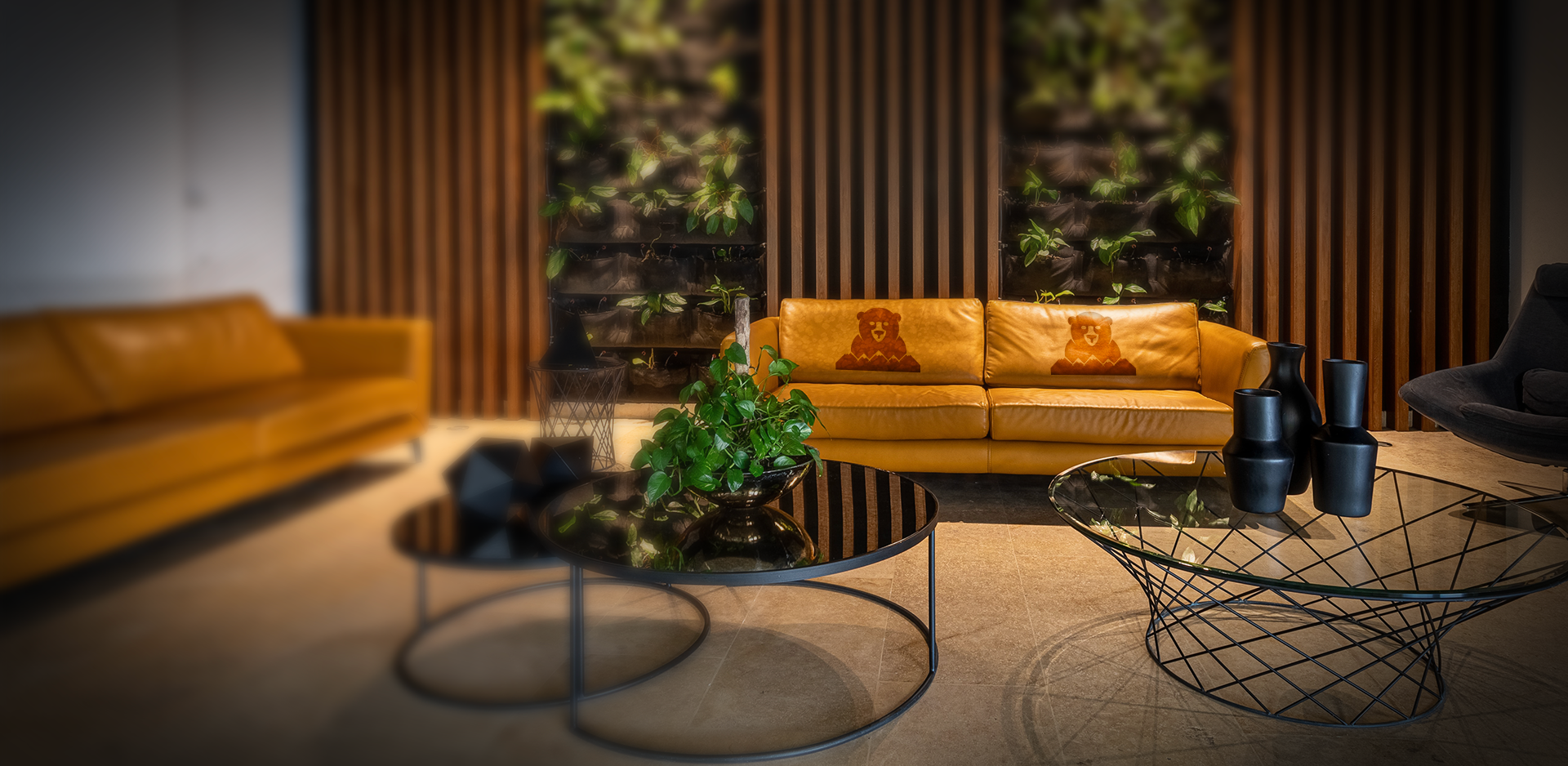
Wildthings Furniture
A natural high quality furniture company made with the highest quality leathers and materials to last a life-time. What came from this was one badass bear, cool mountains, and some comfy furniture.
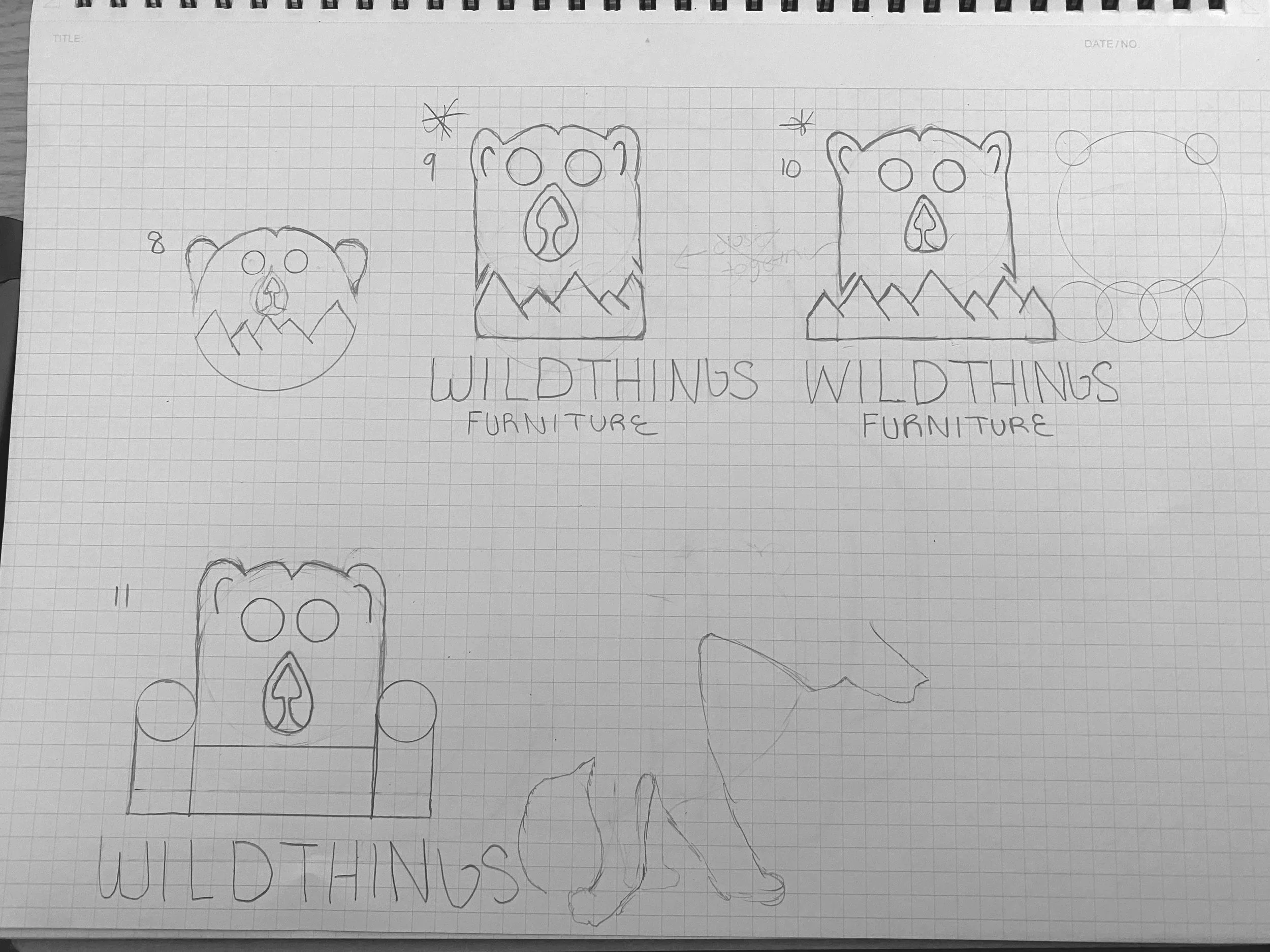
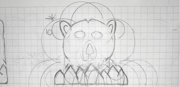
Ideation
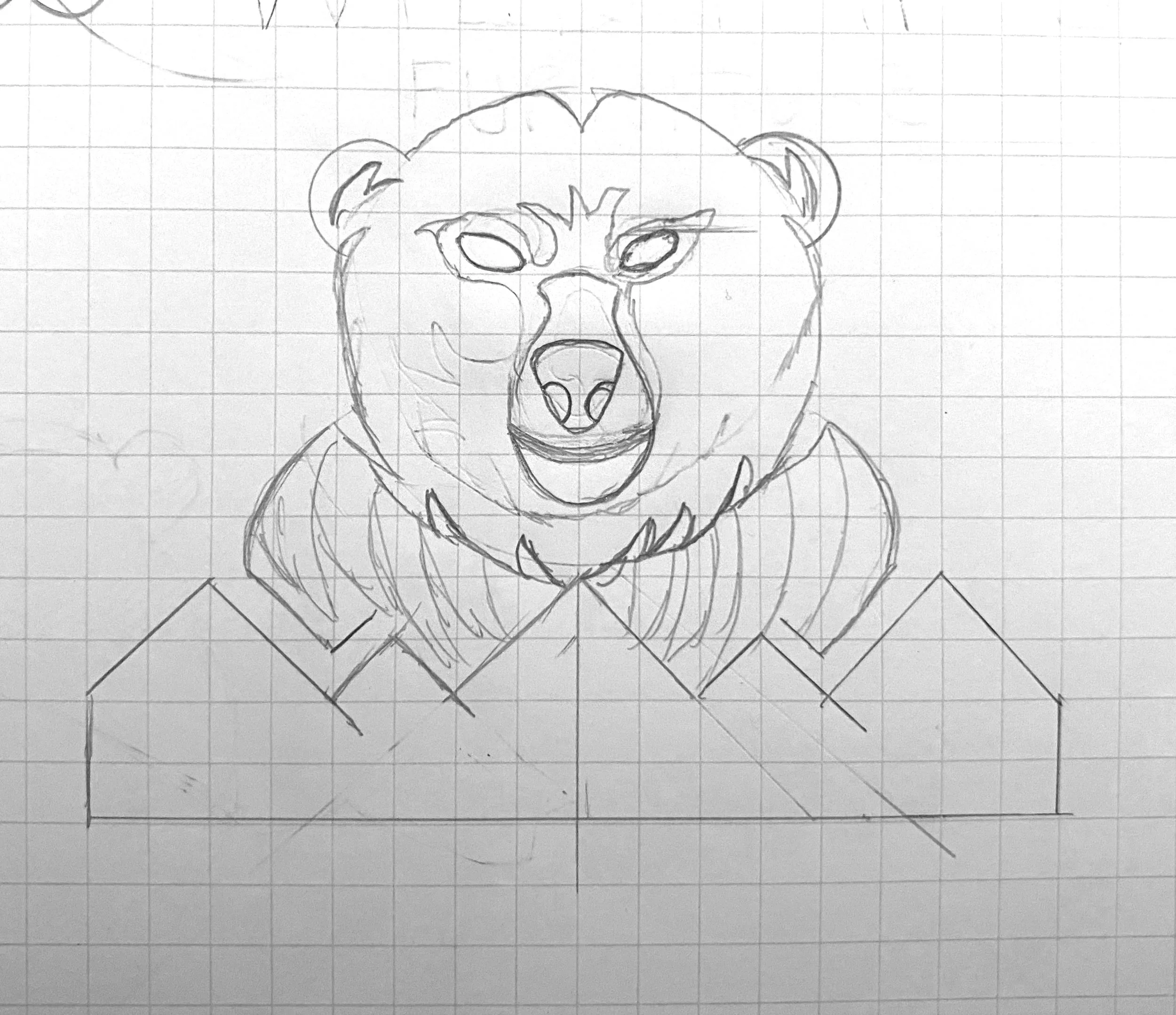
For this project, we pretty much had carte blanche as far as brand image went. We were asked to include an animal of some sort, but we got to choose. In the end, we chose a bear. A bear signifies strength, courage, stability, and the ability to endure. With furniture, strength and stability are a must - it’s what defines heirloom quality. As a brand, the word courage can be very powerful. A courageous company that is not afraid to innovate sends a strong message to it’s future customers. Lastly, the ability to endure and push through things in life is very powerful.
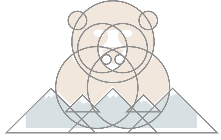
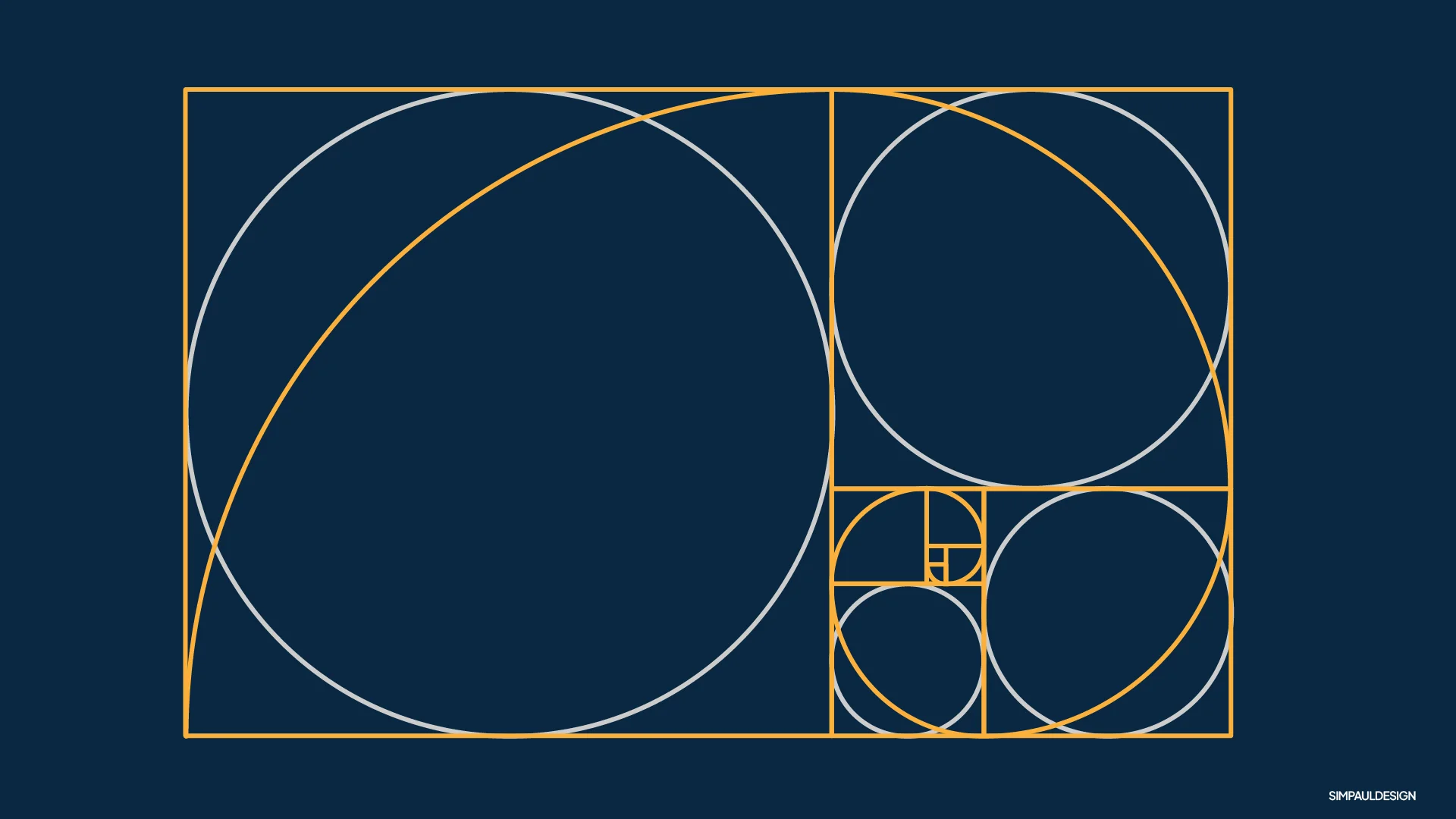
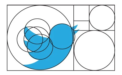
The Golden Ratio
The golden ratio is a skill I always heard about, but never knew too much. Over the years, curiosity got the best of me, and a few branding projects have now utilized the golden ratio. Very simply put, the golden ratio is like a special number (about 1.618) that helps create a sense of harmony, and allows things to feel balanced.
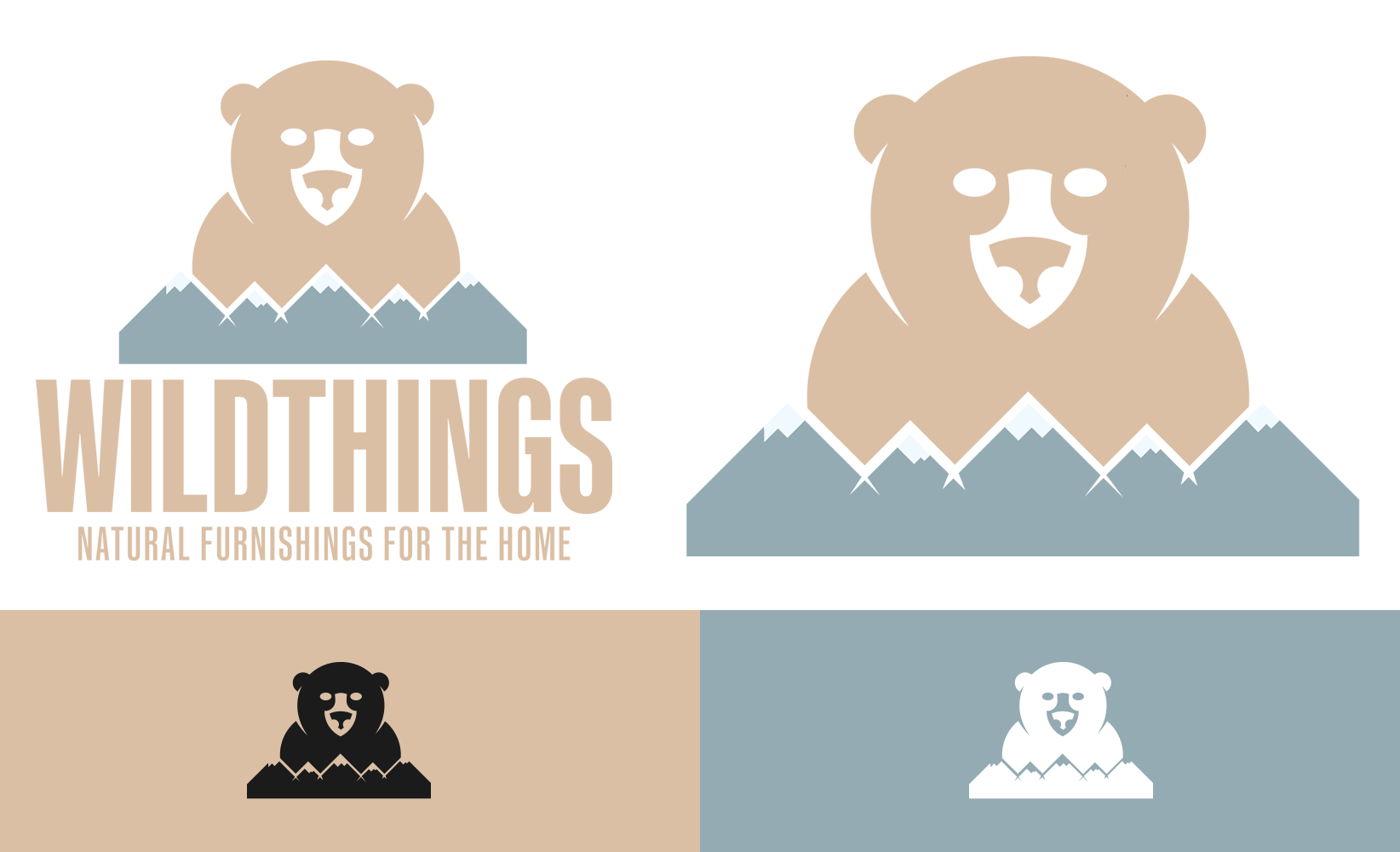
The Final Look
Wildthings! Strong, courageous, and homey at the same time. As some extra goodies, we threw in some business cards, and a custom pattern that can be used for shopping bags.
Ideation | The Golden Ration | Final Look | Programs used: Adobe Illustrator & Photoshop


