

More Work…
Project Overview
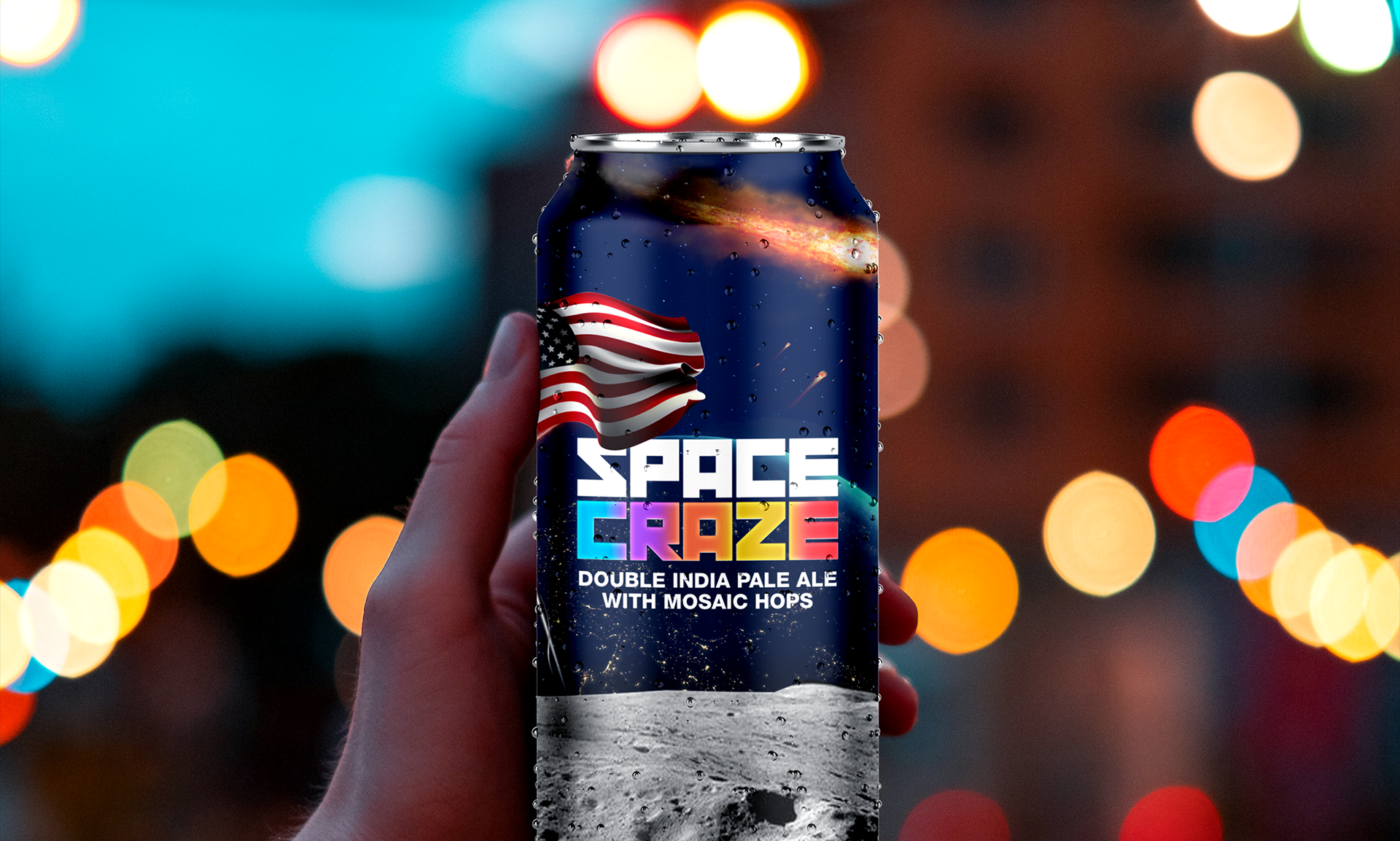

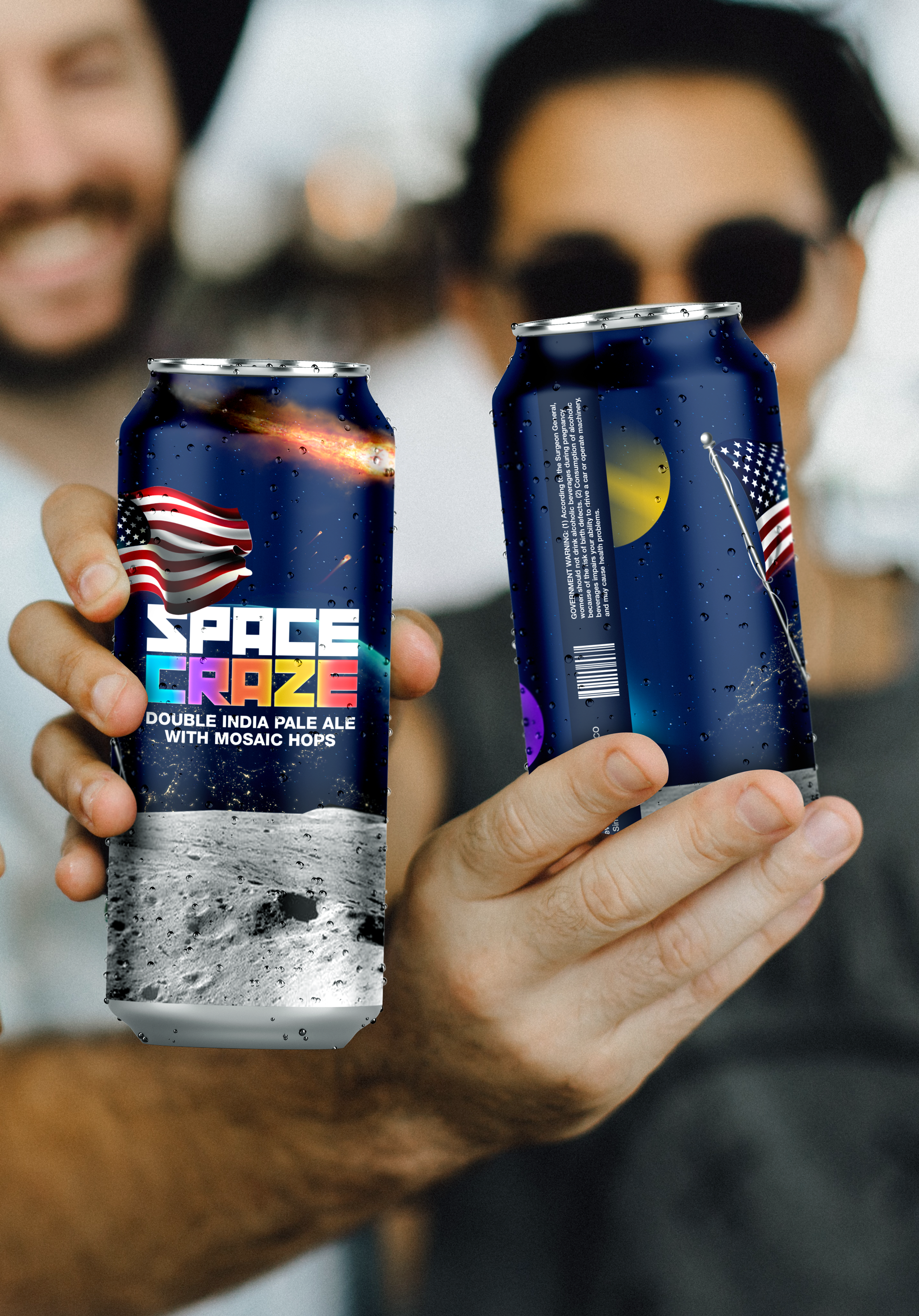
Space Craze IPA
Care for a pint? Space Craze is a double IPA beer concept we created. The idea — a perfect beer to sit out on the balcony with after a long day. Grab your stargazing eyes, sit back, and enjoy Space Craze.
The Label
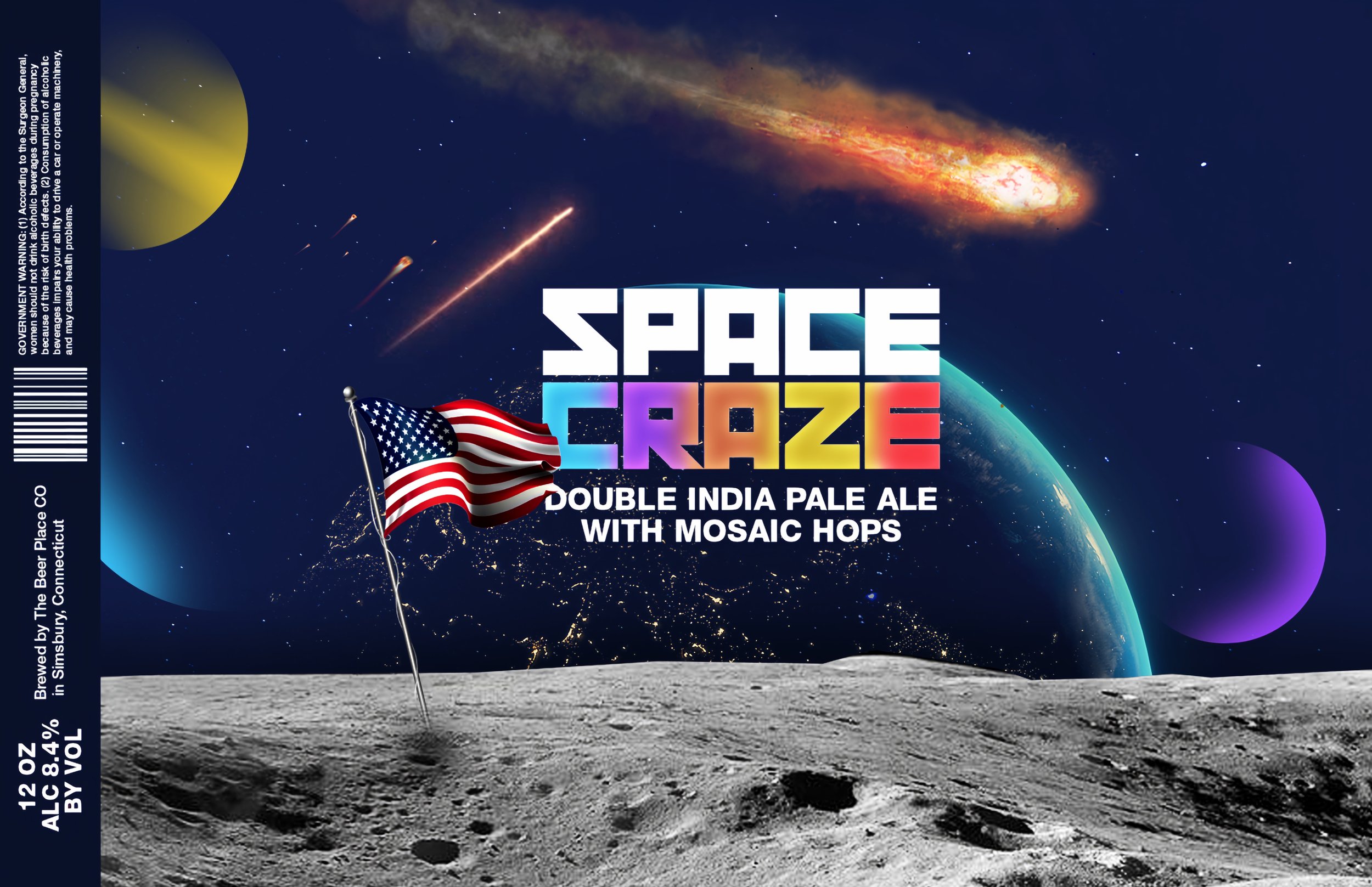
The label itself took a lot of ideation and creativity. While looking around at other space themed examples of IPA cans and bottles, we noticed many lacked a real ‘space’ feel. My goal with this design was to portray the perspective of being on the moon looking down at earth in the distance. With meteors whizzing past, and colorful planets that appear within arms reach, anything is possible with Space Craze.
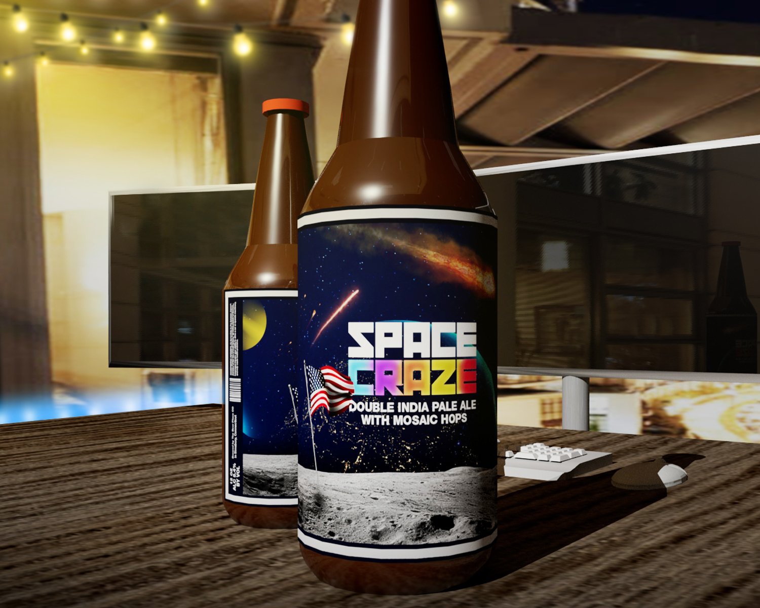

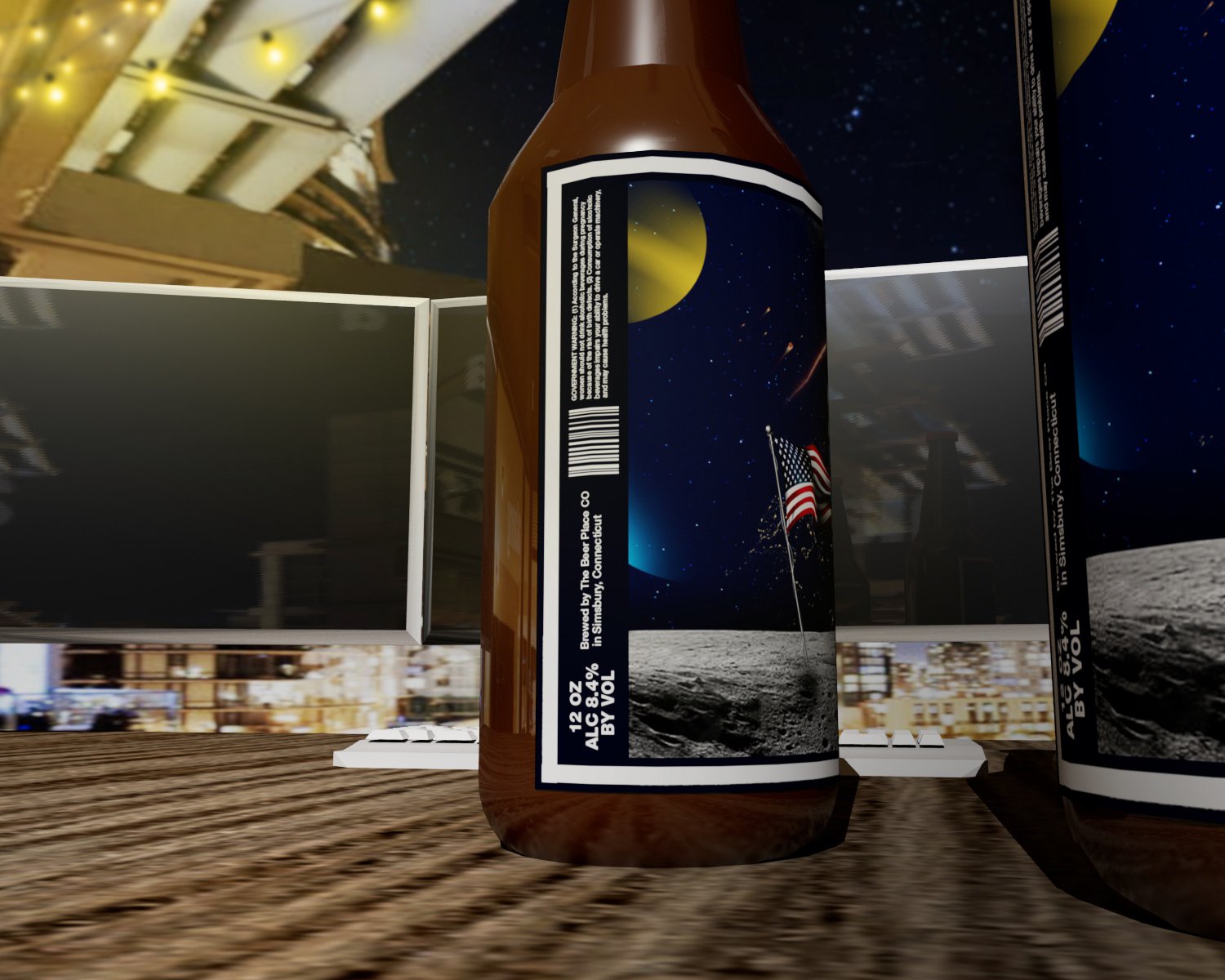
Fun 3D Scene
During this project, we decided to do some extras and mess with a 3D scene. The background scene consisted of a desk setup similar to that of a designer or developer. We situated the desk near the balcony of a house overlooking the city and stars. With LED lights around the desk, and rope lights hanging from the roof above, it’s a perfect scene for Space Craze.
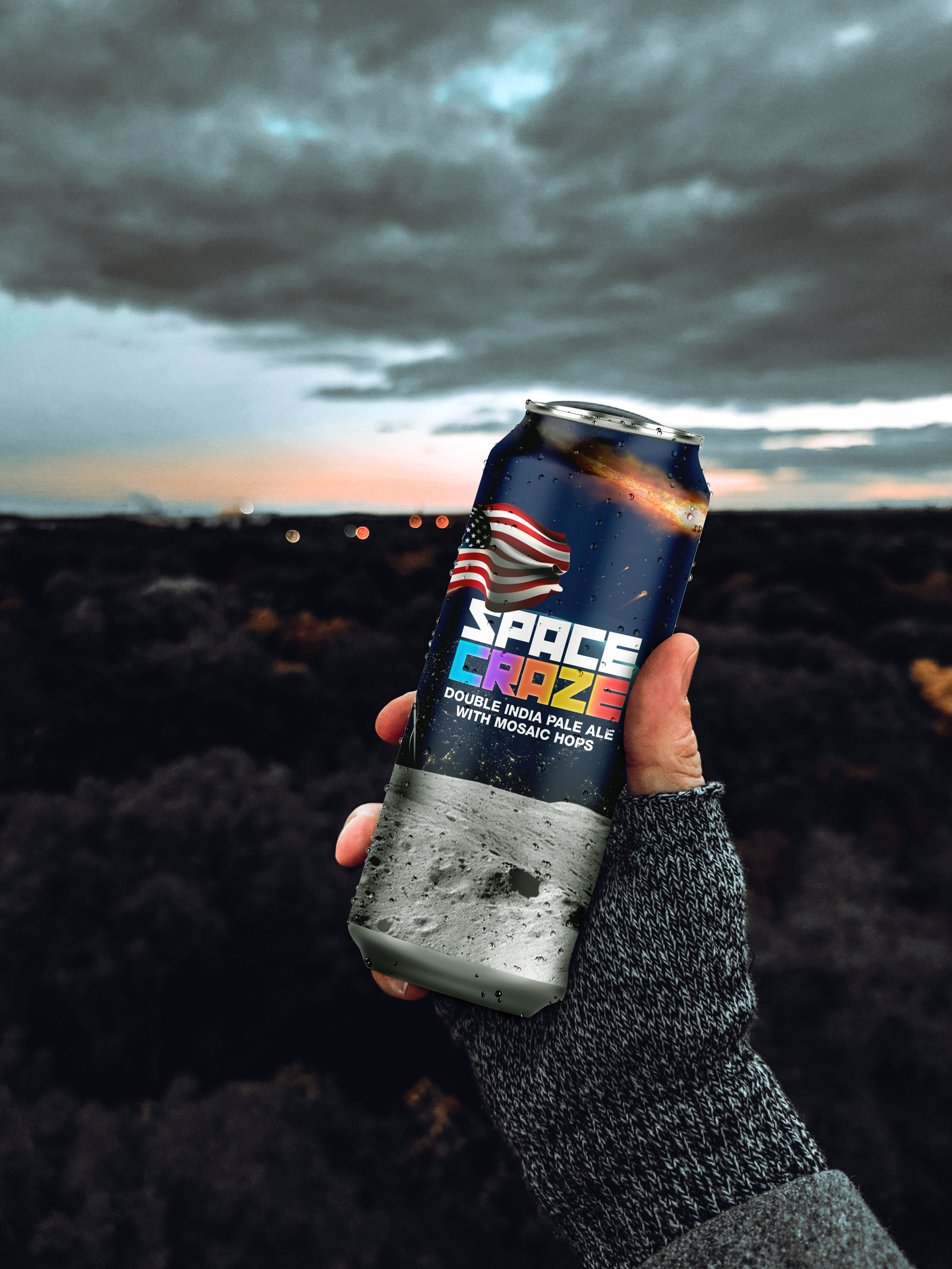
Final Assets
Here is a collection of photos to show off the final label design! Overall, we are very pleased with how it came out, and hope to one day see this at the local brewery or liquor store.


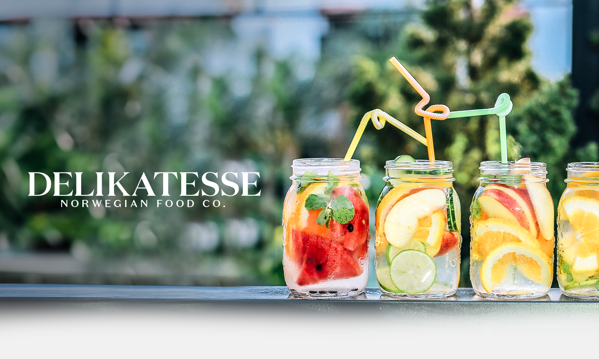

Delikatesse Juices
Delikatesse is a Norwegian food company that specializes in all natural but tasty juices. Being located in Norway, we wanted that very traditional Norwegian design trait of elegance to shine through.

The Brand
When it came to the logo for this project, we chose to go with a typographic logo. With that said, choosing a font was the first test. I knew I wanted something serif to really give off those elegant vibes. In the end, I settled on a font from one of my favorite type artists of all time, Kris Sowersby from Klim Type Foundry. The font — Domaine.
Small Changes
Although this font was already such a great starting point, there were a few areas we had to adjust to get where we wanted it. The kerning needed extensive work (the spacing between each letter), and the spurs (piece that extends from the curve in a letter) and tails of the font were adjusted.

Bottle Designs // Sketches
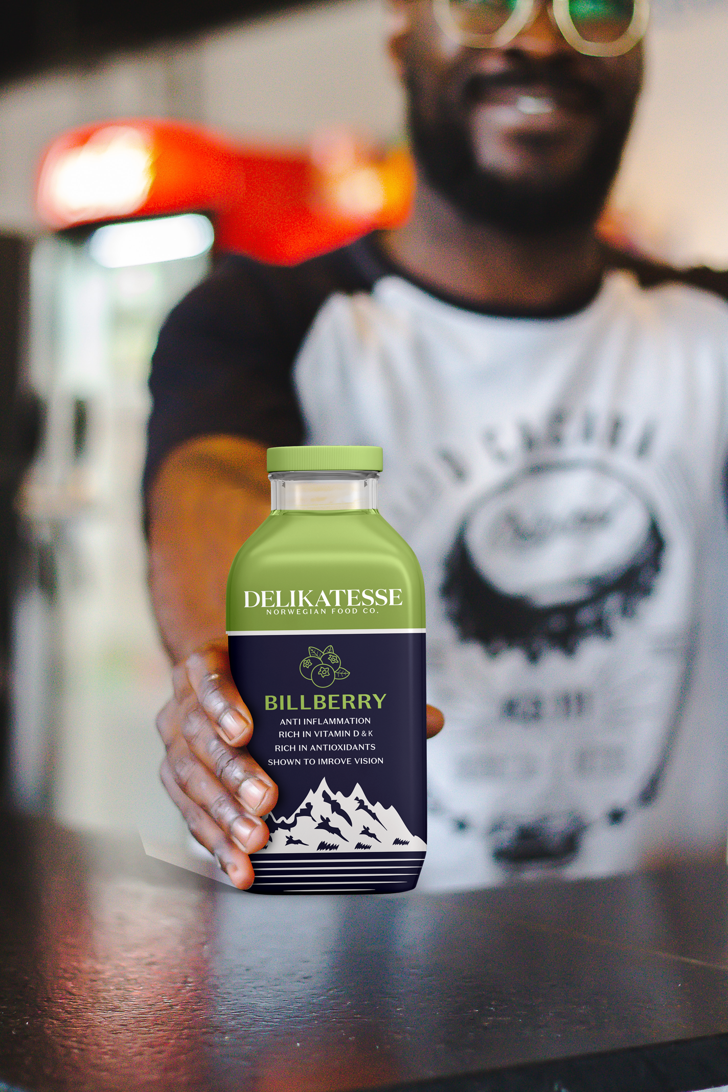
After the logo was set, the next step was the juice bottles. Three were needed — apple, orange, and bilberry. Usually, we’re huge pencil and paper type designers, and love to scribble to see what comes to mind. For this project, however, one of our first few sketches really resonated with us, causing us to pretty much halt the sketching, and go right to the computer. Looking back, we’re incredibly happy we followed our instincts.
Final Look
Here is a collection of photos to show off the final bottle!


Animation
Over the years, we have taken on less animation projects than others types of projects, however, we love when an animation project comes through.
Coinbase Sweepstakes
Coinbase reached out for graphics for an upcoming sweepstakes giveaway, including an all-inclusive trip to IEM Dallas to meet the players, attend the tournaments, and much more. We got to work creating some eye-candy for the giveaway!
‘DCruzITM’ Video Intro
This intro was created for a stock analyst channel, DCruzITM. After creating his social headers and streaming overlays, I aimed to bring that same theme and feeling to this intro.

‘Z’ Logo Animation
This was initially done for a good friend ours named Zach. We were looking for a logo that fit his personality as a very “go with the flow” type person. We then decided to bring some animation into the logo, accenting even further that flowy vibe.
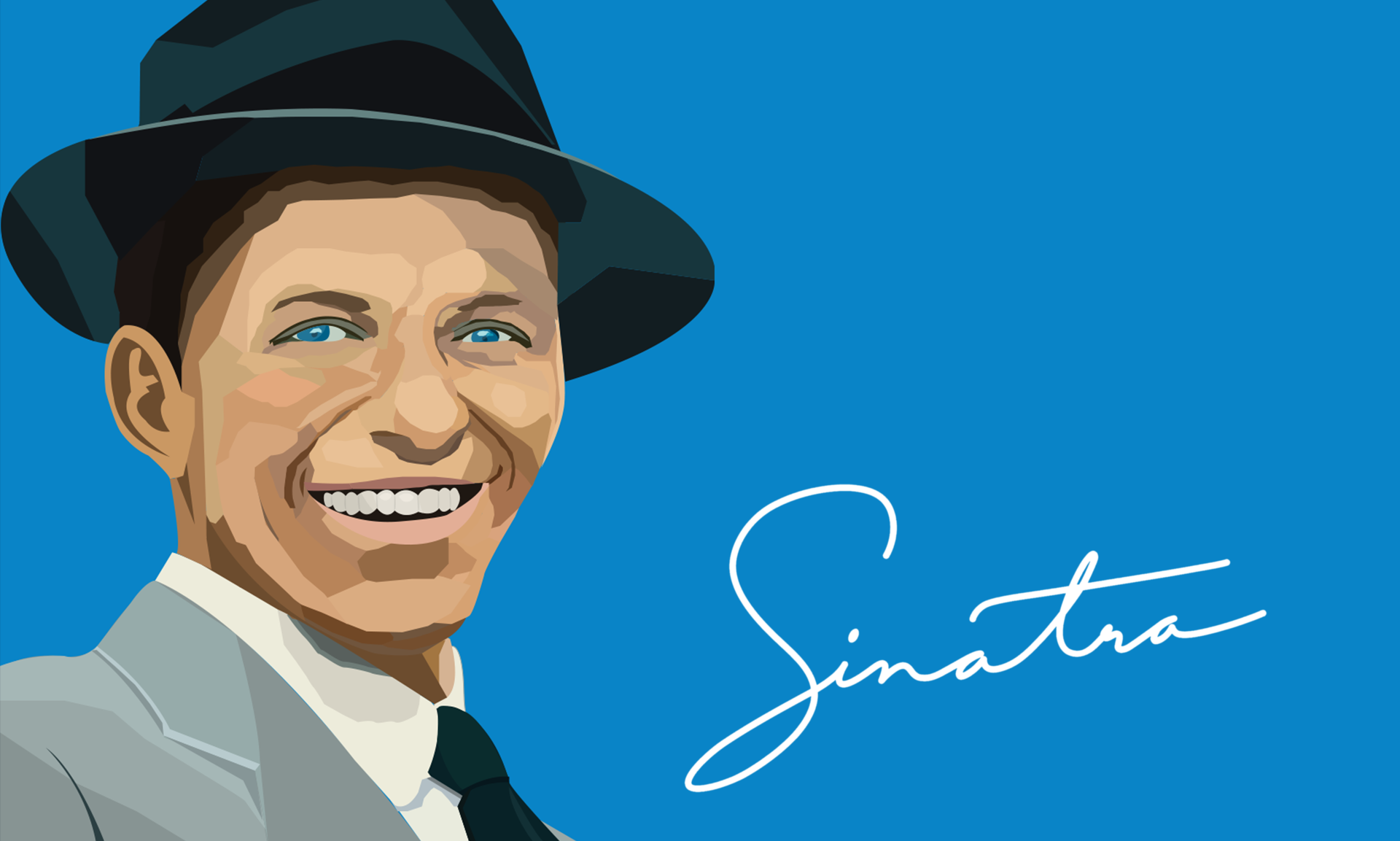
This illustration was done completely as a passion project during late nights listening to oldies. Our grandfather always had the oldies playing while we were growing up. Lou Rawls, Sammy Davis Jr., Frank Sinatra - even Jimmy Durante. As such, we grew up having a great appreciation for this era of music.
Frank Sinatra Portrait


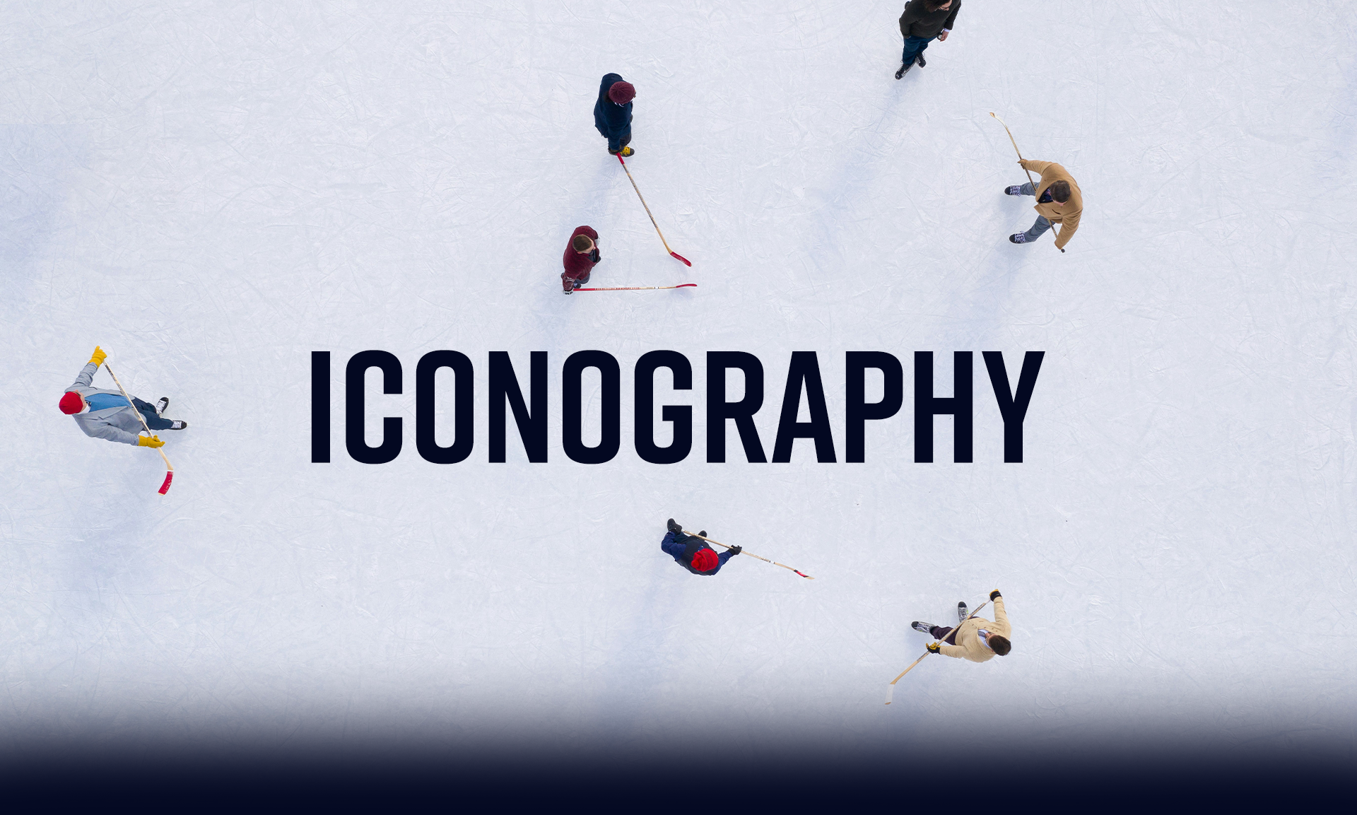
Iconography
Icon design is one of those things that requires patience, a lot of creativity, and a good amount of caffeine.

Ice Hockey Icon Set
As you can likely tell, we are avid hockey fans, so hearing about the opportunity to work with hockey while simultaneously gaining knowledge in the field of icons was great.

Four Seasons Icons
Winter, spring, summer, and our favorite season of all, fall. Living in Connecticut, we are lucky enough to experience all four seasons. For this project, the goal was to create seasonal icons that those in Connecticut would be familiar with; the orange leaves scattering all over in fall, the beaming sun during summer, the park benches and backpacks for spring, and the bombardment of snow during the winter.