Social Media Design
Project Selection


Cascade Maverik Lacrosse
Working alongside Cascade Maverik & Bauer Hockey, we created some freelance test work for two previous lacrosse stick products that were released. Two full briefs were given, and we got to work!
Creative Process
Initial Discussions | Visual Direction | Branding | Concepts | Final Work
Ascent+
Target Demographic:
The Elite Player
16-22 Year Old Females
Performance Consumer
Looking for a Competitive Edge
Product Notes:
For control on the move, high powered shots, and accurate passes.
Enhanced stiffness and new scoop geometry for ground balls.
Tagline:
It’s you, plus _____.
Example: Control, power, swagger
Havok2
Target Demographic:
The Parent (& son)
40-50 Years Old
Purchase Power
Cares About Safety
Cares About Kids Happiness
Does Their Research
Wants Son to Look Cool
Product Notes:
For precision checking, accuracy in transition, control through contact, & ground ball possession.
Tagline:
Disrupt the Game
Initial Discussion & Brief
When first meeting, we were supplied with two completed briefs consisting of project requirements and goals, as well as any assets needed.
The core idea was two product launch campaigns, one for Ascent+ (an elite women’s lacrosse stick, geared towards a demographic of women aged 16-22) and Havok2 (a men’s defensive stick, with a target demographic of both parents and their sons.)
Visual Directions
After the initial discussions, we really wanted to nail down a few different directions while taking into account overall project goals and target demographics.


Direction Choice
Ascent+
Starting off, we decided to move forward with the elite vibrance direction for Ascent+, as we really felt females in lacrosse deserve that tough look, while at the same time exemplifying elegance and agility on the field. We also felt that although we are always looking to reach the peak of our game, the ascent to the top direction was a bit too literal.
Havok 2
For Havok 2, we opted to go the route of digital destruction: With the idea of disrupting the game coming up throughout the brief - we felt the destructive and glitchy look really suited the overall goal of the brief. We also wanted these graphics to exude speed and a sense of control through the chaos.


Branding
Ascent+
A logo that feels bright, clean, elevated, and precise.
Select a serif font as a way to depict a feeling a trust, respect, and strength in the space of lacrosse,
Although a serif font, the unique curvy nature of certain aspects such as the bar or line of the ‘E’ adds a dynamic and flowy feel.
Ultimately, elegant but powerful was the goal here.

Havok2
A disruptive and glitchy look, while emitting a sense of warping through time.
Utilize chromatic aberration which plays a trick on the eyes, and further pushes the disruption effect.
Italicized and sporty font allows for a feeling of speed and control through the disruption.


Concepts
After deciding on branding for each product, we started to brainstorm looks and feels for each graphic, taking into account textures, patterns, colors, text treatment, hierarchy, CTA’s, and more.
As you’ll see, many of the finals look different from the very early concepts. Although these were possible directions, we felt both did not ultimately fit every goal and keyword set out in the moodboards. That’s why we make sure to test throughout our process, to insure that the brands values are properly conveyed.

Ascent+ Final Work
Following the ask of creating an advertisement, event graphic, and ecommerce graphic, we decided to create:
2 paid media advertisements for Facebook or Twitter
Story post graphic for Instagram
Event concept
Announcement graphic
Website landing page for the product release.

Creative Notes
Vibrant, bright, elegant, and tough.
Really send a message that the females are warriors of the game, while being able to finesse elegantly down the field with speed and control.
Maverik partnered female players featured.
Ascent+ sticks added into players hands.
Toughness and grittiness comes from the females themselves, and the use of gritty textures and patterns
The vibrant colors, uses of off-whites, and the serif font choice adds the feeling of elegance.
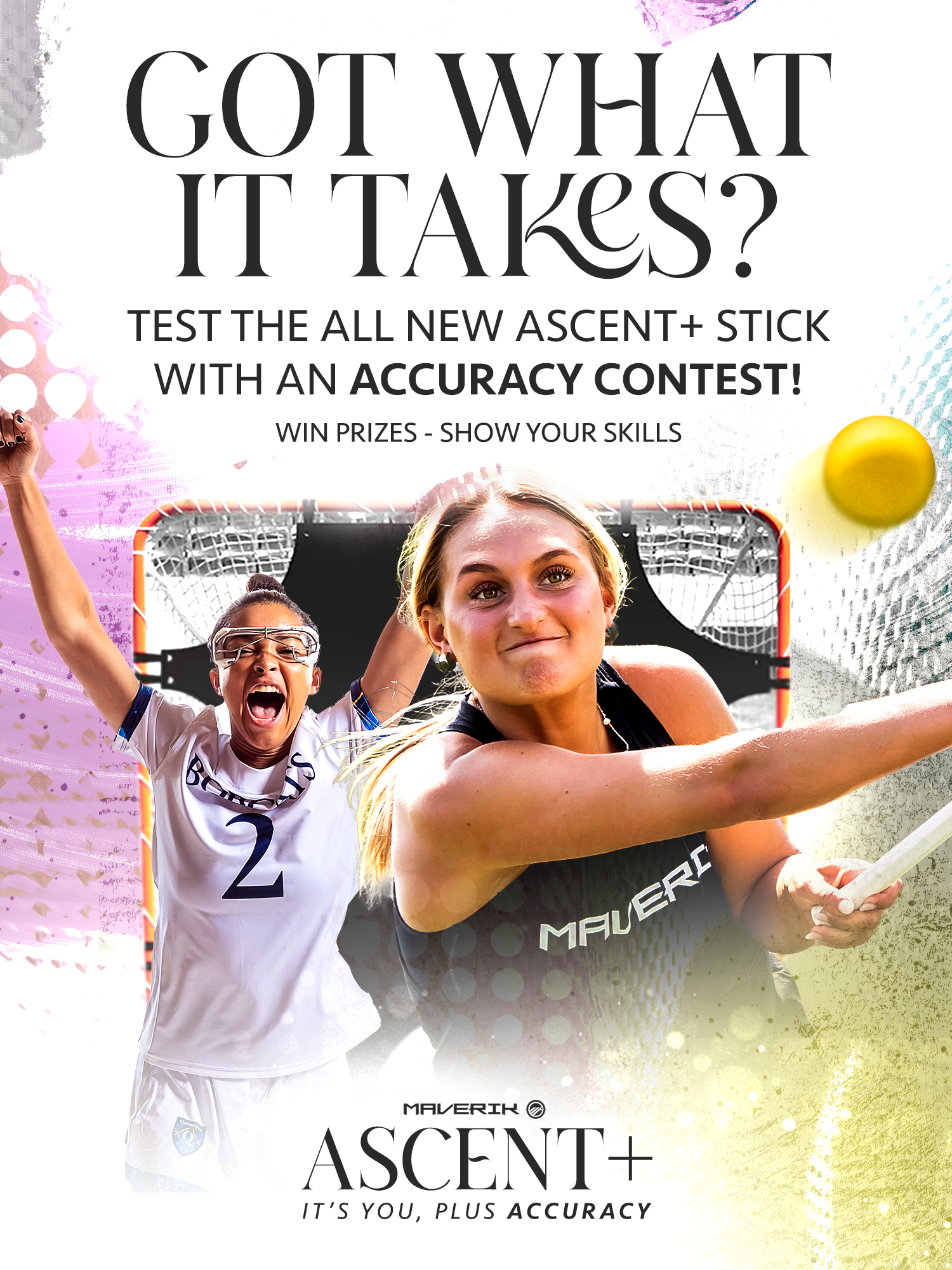

Event Idea & Explanation
Demo booth for the fans and players to test their skills with an accuracy shooting competition!
This gives a chance for fans and players to try new technology, challenge friends, and win some prizes.
Players must hit as many shots as they can in 20 seconds with the Ascent+ after having a few warmup shots. Most shots made, wins!
Prizes include a swag bag of merch and a raffle for an Ascent+ stick.


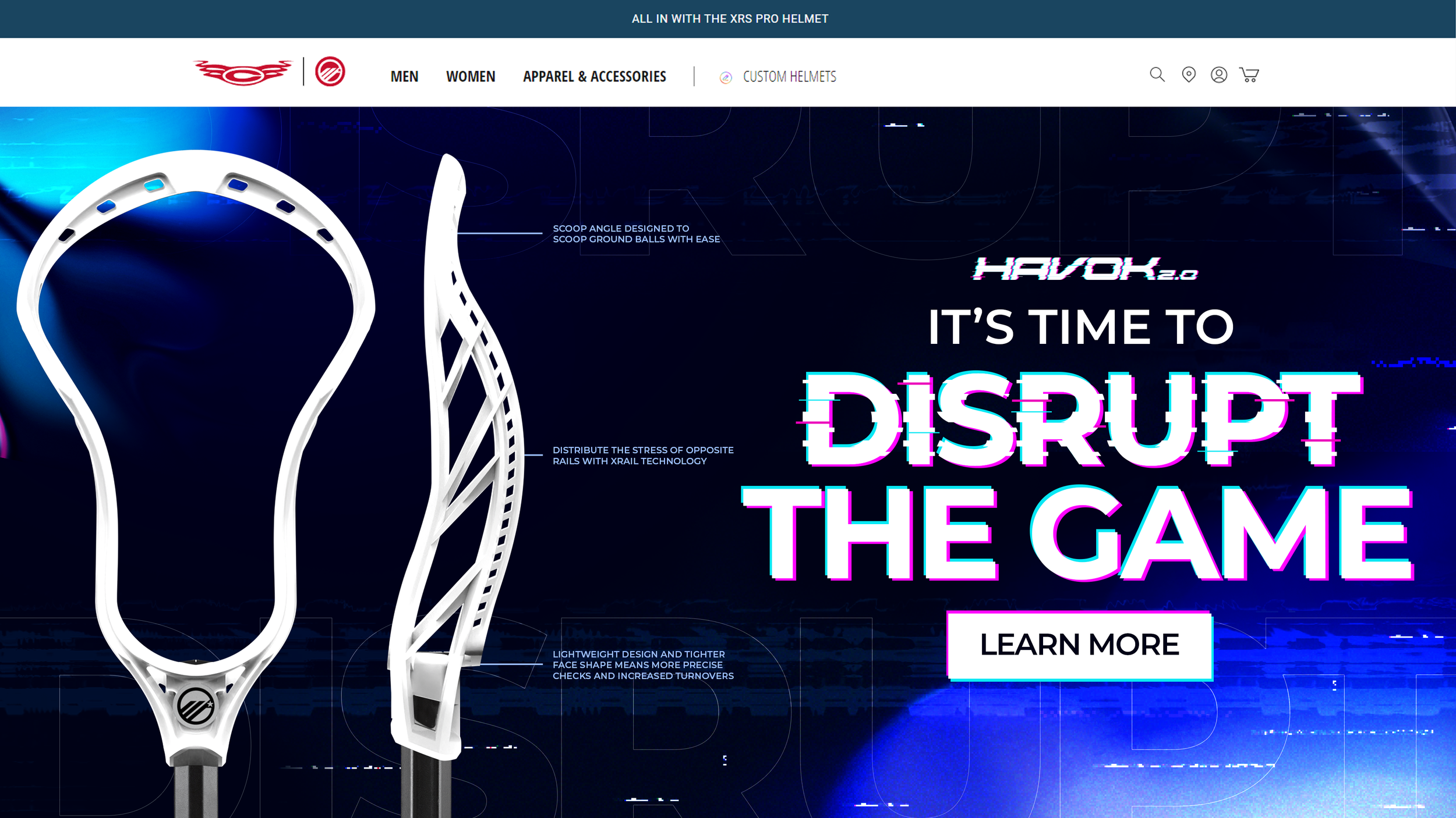
Havok2 Final Work
Following the ask of creating an advertisement, event graphic, and ecommerce graphic, we decided to create:
2 paid media advertisements for Facebook or Twitter
Story post graphic for Instagram
Event concept
Announcement graphic
Website landing page for the product release.

Creative Notes
Really leaning into that chromatic aberration, which very simply put, is a color distortion that helps to play a glitchy effect on the eyes.
Player faces stay unaffected, showing they are always in control amist the chaos they create.
Any Cascade / Maverik logos unaffected as well to ensure brand recognizability.
Dark blue picked to demonstrate a sense of passion, trustworthiness, and power.
Sleek for the parents, cool for the kids.


Event Idea & Explanation
Pro Q&A featuring two current or past pro lacrosse players. In this case, we used Paul Rabil and Rob Pannell as the examples.
Parents, children, and young adults can ask any questions in a unique face-to-face with the pros!
After the Q&A, players and parents of all ages can have a chance to try some shots with the Havoc2, and test some deadly accurate stick checks on a mannequin dummy.
This will get fans to the booth, and get the product in their hands.
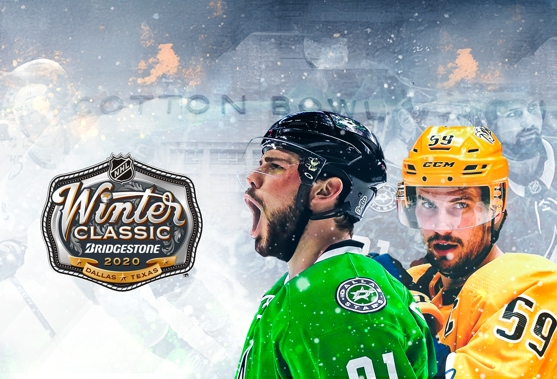

NHL Winter Classic
The Winter Classic is an annual event held on January 1st, where two professional hockey teams play a regular season game outdoors in a football or baseball stadium. This event aims to evoke nostalgia for both players and fans, recreating the outdoor pond hockey experiences from the past. It allows current and former players, as well as fans, to relive those cherished memories of playing hockey outdoors with friends and family.

The Importance
Zack, our creative director, played hockey for 15 years growing up, finding solace in the sport during any stressful times in his life. During these times, hockey became a lifelong passion. Now, with skills in Adobe products, he enjoys creating better visuals to promote hockey, and really tap into that emotional connection behind it.
For the 2020 Winter Classic specifically, he felt some of the graphics were lacking that outdoors feeling. The Winter Classic to all of us is about evoking those memories to fans watching. The misty clouds of condensation coming off our breath in the cold, rosy red cheeks, the bright whites of snow dusting over the ice, and that callback to feeling as though we returned to our ponds for a small pickup game before we’re called in for dinner by our parents.

Inspiration
The mood-boarding stage was pretty straightforward, as we had so many past ideas already in mind for this event. However, we felt it was necessary to take a look at the current graphics for the event before coming up with the overall look. As mentioned above, we felt as though the graphics for this event somewhat lacked that outdoors feeling. We wanted a random person looking at these graphics, hockey fan or not, to want to be at this event or watching from home on the television.
Final Results

Overall, we are very pleased with the result of this project. Throughout, the goal remained to really depict that outdoors feeling and represent the emotion behind it.


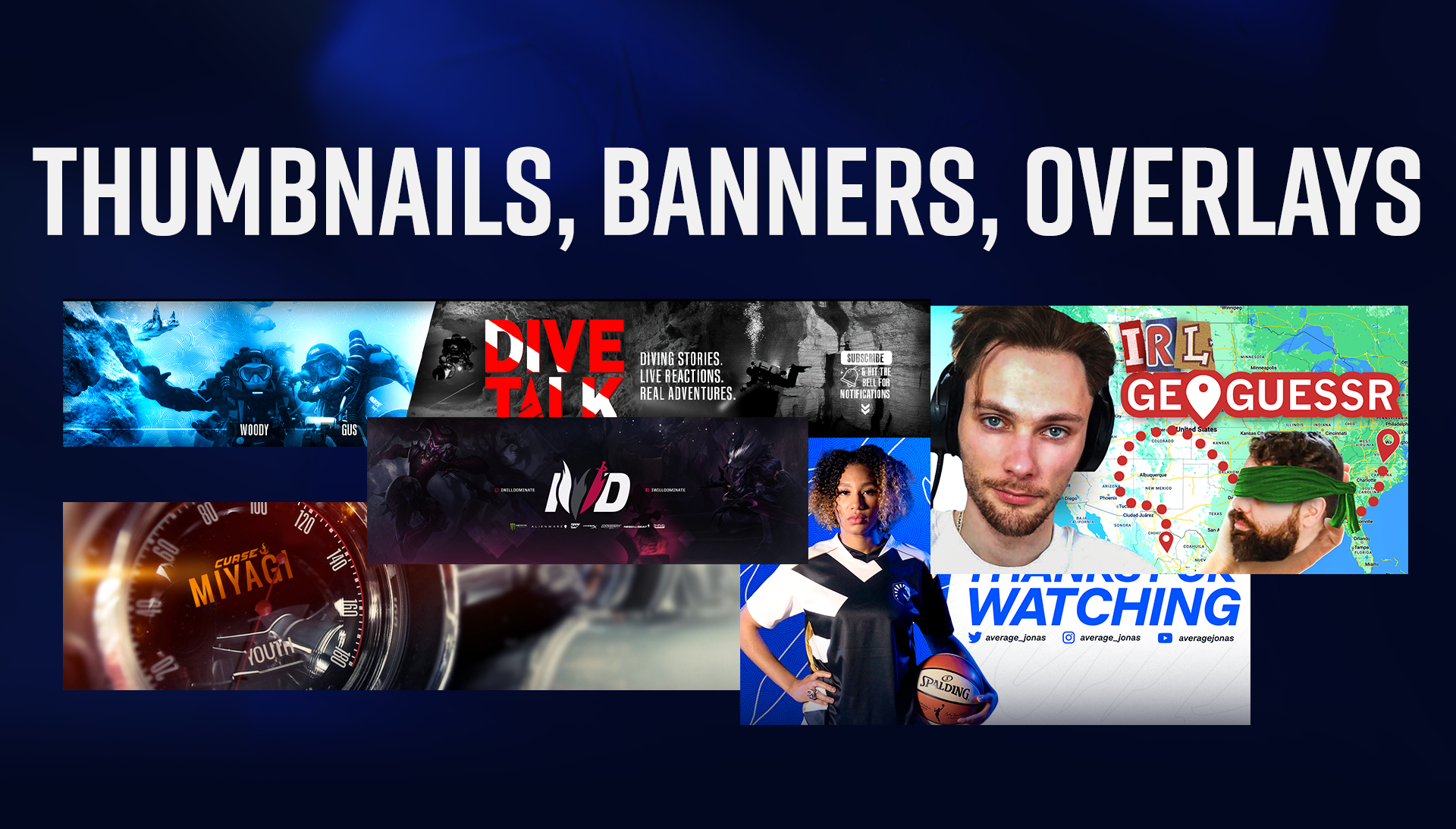
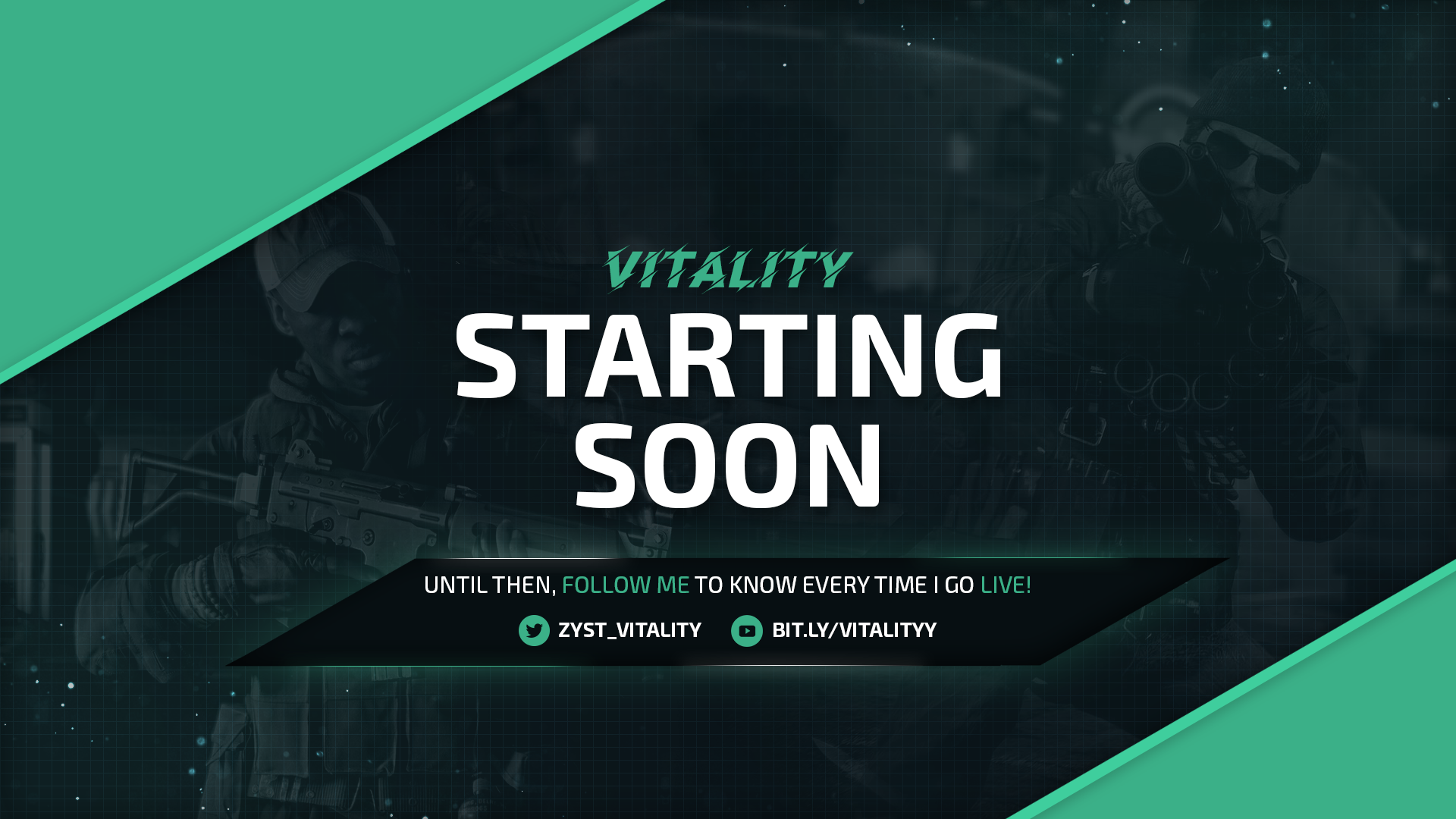
YouTube Thumbnails
YouTube thumbnails are the first impression of your content—before a viewer even hits play. A well-designed thumbnail grabs attention, stops the scroll, and increases clicks, directly impacting video performance. With millions of videos uploaded daily, standing out is essential. Bold typography, striking visuals, and clear branding not only boost visibility but also establish recognition, helping your audience instantly associate your content with your brand.


Social Banners & Streaming Overlays
Streaming overlays and banners create a cohesive, professional look across platforms like Twitch and YouTube Live. They reinforce brand identity, making streams visually engaging while enhancing viewer experience. Whether it’s a custom webcam frame, alert box, or offline banner, great design helps streamers look polished, attract sponsors, and build a loyal audience. Consistency across all visuals strengthens brand presence, ensuring that every stream feels like a recognizable, high-quality production.